Judging Books by Their Covers

Over the last few months, I've spent much of my time outside of work on my book, now titled Your Home, Your Style, which is inching its way toward publication. (Official release date: April 2018). 

One thing my editor, publisher, and I have spent a lot of time working through is the cover design. Because this is a home decor book, it's extremely important to me that the cover is one that people will eagerly display in their spaces. It's not lost on me that the most successful and beloved design books of the last several years all have a striking visual presence and inevitably become part of their owners' decor. I want the book to sit out on people's coffee tables, consoles, and bookshelves, begging to be picked up and flipped through a few pages at a time.

If course, it wouldn't hurt if the book's design landed it in photos that bloggers and stylists share on Pinterest, such as this vignette showcasing designer/blogger Erin Gates's bestseller Elements of Style. I mean, how can you NOT want to take this whole look home?

Source: Swoon Worthy

Source: Swoon Worthy

Then there's this lovely vignette I spotted on the blog Waiting on Martha, featuring Carolyne Roehm's A Passion for Blue & White. I love the book, the flowers, the collected objects, everything.

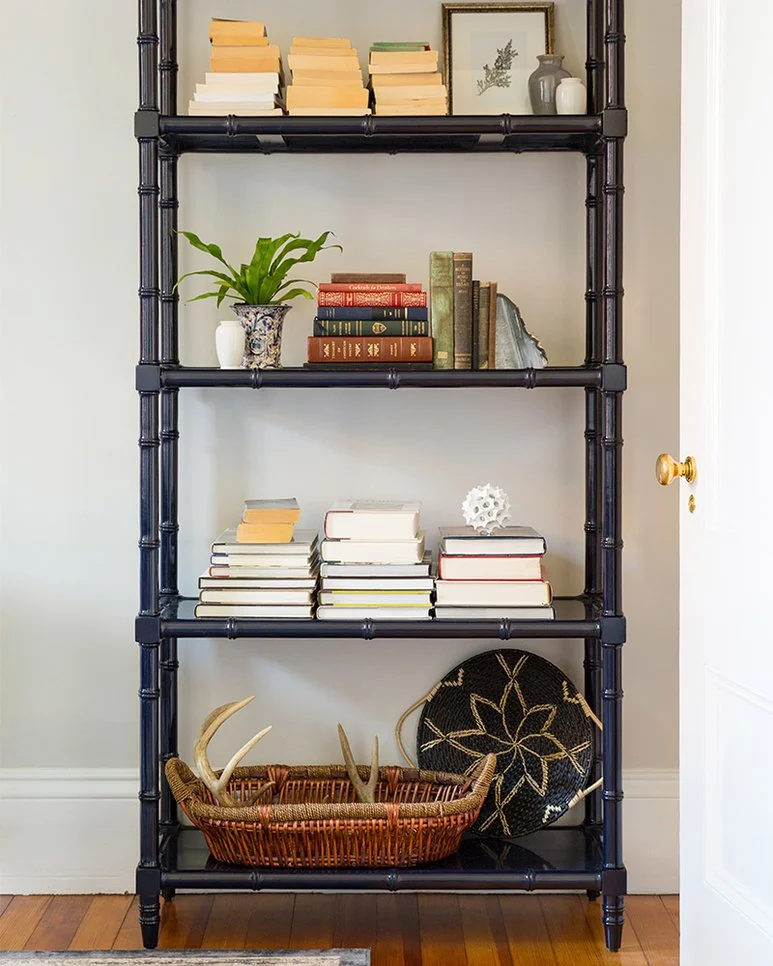
I adore how books fit into this space by designer/blogger Paloma Contreras at the New Orleans Showhouse:

Here, designer and blogger Justina Blakeney shows how colorful books, including her own bestseller The New Bohemians, can be objects of layered beauty:

Source: The Jungalow

Source: The Jungalow

What if my cover was so good that it would just pop up in magazines or catalogs as a prop from time to time? OMGIWOULDDIE.

Source: William-Sonoma

Source: William-Sonoma

But creating a book that lots of people will want to display is not as simple as choosing a pretty color or picking a nice photo to put on the front. I also want my book's jacket to reflect the contents, and because the homes I feature inside don't share the same aesthetic, there's no one image that represents everything within. I also want the book to be able to fit into every style of home, from traditional townhouses to breezy beach houses, modern lofts, eclectic bungalows, and more.

It's a tall order, but we're making progress. My uber-talented book designer is Laura Palese, who has designed books for Gwyneth Paltrow, Chrissy Teigen, Laura Prepon, and more. She's a rockstar. We've landed on a tentative cover look, and while I won't be able to share images until September, one element that we're currently planning to incorporate is this embroidered linen pattern I first spotted on a pillow on Joss & Main:

Embroidered_linen_pillow

It wasn't easy finding a print or texture that could cohabitate with traditional, modern, coastal, bohemian, and other decor styles equally well, but I think this one's pretty versatile, don't you?. If you look closely, the fabric has a great linen weave, and I'm hoping we can recreate some of tactile effect with slight embossing. We'll see.  

What do you think? Do you have any coffee table books on display, and what made you choose them? Have you ever purchased a book based on looks alone, and where did you put it? Comment below...

Obsessed With: Black Fringe

March is a crummy month in New England. Forget "in like a lion, out like a lamb"—It's March 31 and we're all still huddled into our ice-encrusted houses like polar bears trying to keep warm. Forgive me for not running out to buy gauzy, flowy, Coachella-chic resort wear... I'm spending the weekend parked under a throw blanket with a bourbon-and-bitters IV drip. Home, right now, feels heavy. Stuffy. Stagnant. 

At the same time, I'm aching for any nod to summer style, especially at home. It's been so long since the holiday wreaths and lights came down, and I'm ready for something fresh (but not too fresh—we won't be embracing the al fresco lifestyle for a few more months yet).

Enter these picks. The perfect balance of dark and light, fresh and funky, items pairing black tassels and pompoms with sheer and natural materials feel like the perfect blend of breeziness and edge for this in-between season. I want everything.  

1. Aldous shower curtain, $50, Joss & Main. 2. Xinh clutch in Noir, $16, Xinh & Co. 3. 100-percent cotton Euro sham, $53 for a set of two, Wayfair. 4. Tassel throw blanket, $25, Target. 5. Kate Spade New York Tassel Stripe throw pillow, $129…

1. Aldous shower curtain, $50, Joss & Main. 2. Xinh clutch in Noir, $16, Xinh & Co. 3. 100-percent cotton Euro sham, $53 for a set of two, Wayfair. 4. Tassel throw blanket, $25, Target. 5. Kate Spade New York Tassel Stripe throw pillow, $129, Wayfair. 6. Creative Co-Op Collapsible two-piece basket set, $59, Wayfair

What are you craving for your home and wardrobe in these doldrum days? Leave a comment and let me know what you'd like to see more of!

Featured! A Trio of Bedroom Makeovers

Pillows, headboards, nightstands… Lately it seems like all I’ve been looking at is bedrooms. Lucky for me, the spaces—and homeowners—I’ve had the chance to work with in the last two months have been nothing short of dreamy, and the love for the resulting rooms has been pouring in from far and wide.

Bedroom-makeovers-Donna-Garlough

First up: In the weeks before Christmas, I worked on behalf of Joss & Main to design master bedrooms for two incredible women, Olympic gymnasts and friends Shawn Johnson and Nastia Liukin. Nastia was moving into a brand-new home near Boston with her fiance, Matt, and needed a soup-to-nuts design. Shawn, meanwhile needed help adding a layer of personality and coziness the relatively bare-bones space she shared with her husband, Andrew, in Nashville. Both women travel almost nonstop, so they were eager to create welcoming retreats where they could go to relax and recharge.

Funny enough, both Nastia and Shawn selected the same bed, a grand yet rustic sleigh style, so part of the challenge was fine-tuning each bedroom design so it felt distinctly like either Shawn or Nastia. I worked with each of the women to create mockups that we could tinker with together, swapping out products until we were both happy with the look.

Shawn’s mockup took on a slightly more feminine, farmhouse feel, with some linen and ticking stripe and different finishes on the bed and nightstands...

Feminine-farmhouse-bedroom

...and here’s how it turned out.

Images credit Nicole Gerulat for Joss & Main

Images credit Nicole Gerulat for Joss & Main

Nastia’s bedroom mockup went in more of a rustic-glam direction, with a crystal orb chandelier and fur throw...

Rustic-glam-bedroom

...and here’s the finished look.

Images credit Nicole Gerulat for Joss & Main

Images credit Nicole Gerulat for Joss & Main

The following month, I worked on my first makeover on behalf of Wayfair Canada, a sister brand to Joss & Main. Angela Price, a Montreal-based blogger and star of the reality show Hockey Wives, wanted a glamorous new look for her bedroom. This one was a thrill to design, as Angela was really into the idea of going moody and dramatic. When I pointed out that a lot of her inspiration images had dark walls, I suggested painting the walls a near-black shade, Domino by Sherwin-Williams, and she was 100% game. (How amazing is it when someone just gives you their total trust? I was giddy.)  Here’s the mockup we created together…

…And here’s the finished room.

All images credit Marie-Lyne Quirion for Wayfair Canada

All images credit Marie-Lyne Quirion for Wayfair Canada

I’ve been overwhelmed by the great coverage these bedroom makeovers have gotten, including three features on People.com and a nod on the Montreal blog MTL, as well as Shawn, Nastia, and Angela's own blogs.

Do any of these bedrooms speak to your style? If so, which would you choose? Leave a comment below!

What to Do With Brown Kitchen Cabinets

Honest question: Has any home feature been vilified more than brown cabinetry in the last fifteen years? Seriously. Watch any episode of House Hunters or any home-renovation program on TV, and you’ll see young home buyers wrinkling their noses at kitchens featuring dark wood cabinets and grayish-brown granite countertops. “I want a white, bright kitchen,” they’ll say, sneering at the glossy finishes. On Pinterest and in shelter magazines, dream kitchens in white and pale gray tones dominate the scene.

Here's why I have brown on the brain: A friend living outside Boston recently reached out to me about her own brown kitchen. She and her husband are planning to rip out the countertops, flooring, lighting, and cabinet hardware, but they can’t decide what to do about the cabinetry itself. On paper, the cabinets are are everything they want—solidly built and configured relatively well for the space. The problem is their deep chestnut color:

The pre-renovation kitchen.

The pre-renovation kitchen.

While the “she” in the party would love to paint everything a pale shade, like all of the kitchen designs she’s pinned online, he’s hesitant to sand and paint over the wood grain, which stands as evidence of the cabinets’ handmade, hardwood construction.  

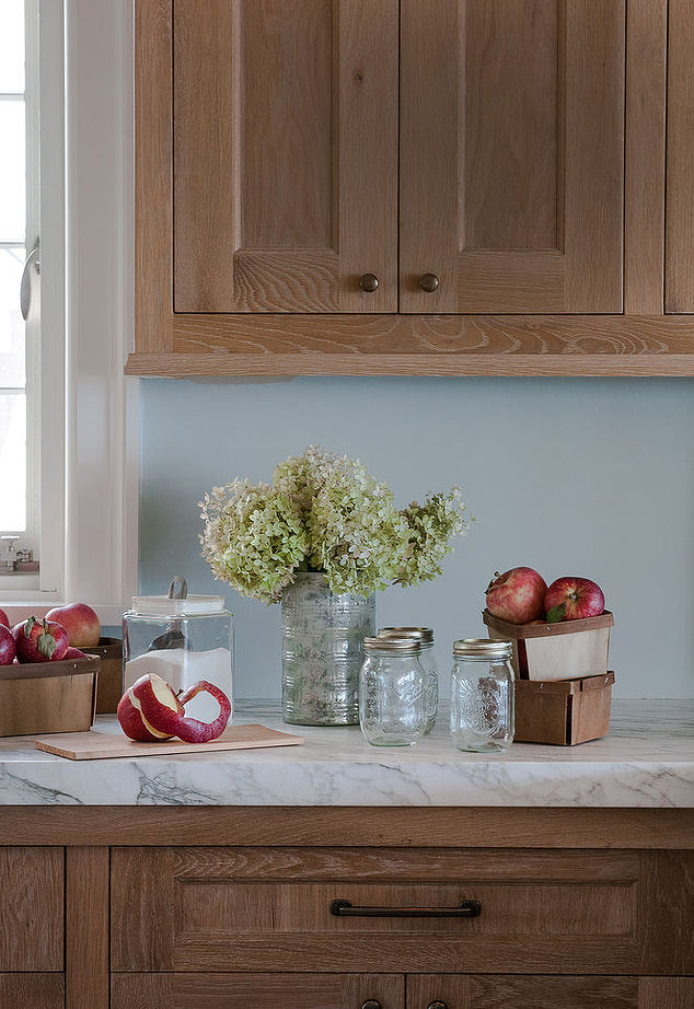
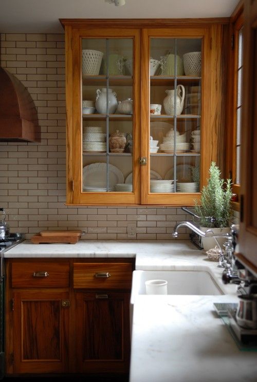
It got me thinking: Is it possible that brown kitchens have gotten a bad rap? Are there any drool-worthy brown kitchens out there? Forget the builder specials with Home Depot faucets and the cheesy, ornate, faux-Tuscan Real Housewives kitchens that dominated the early aughts. (You know what I’m talking about: this and this.) What does the brown kitchen of today look like, if there even is such a thing?

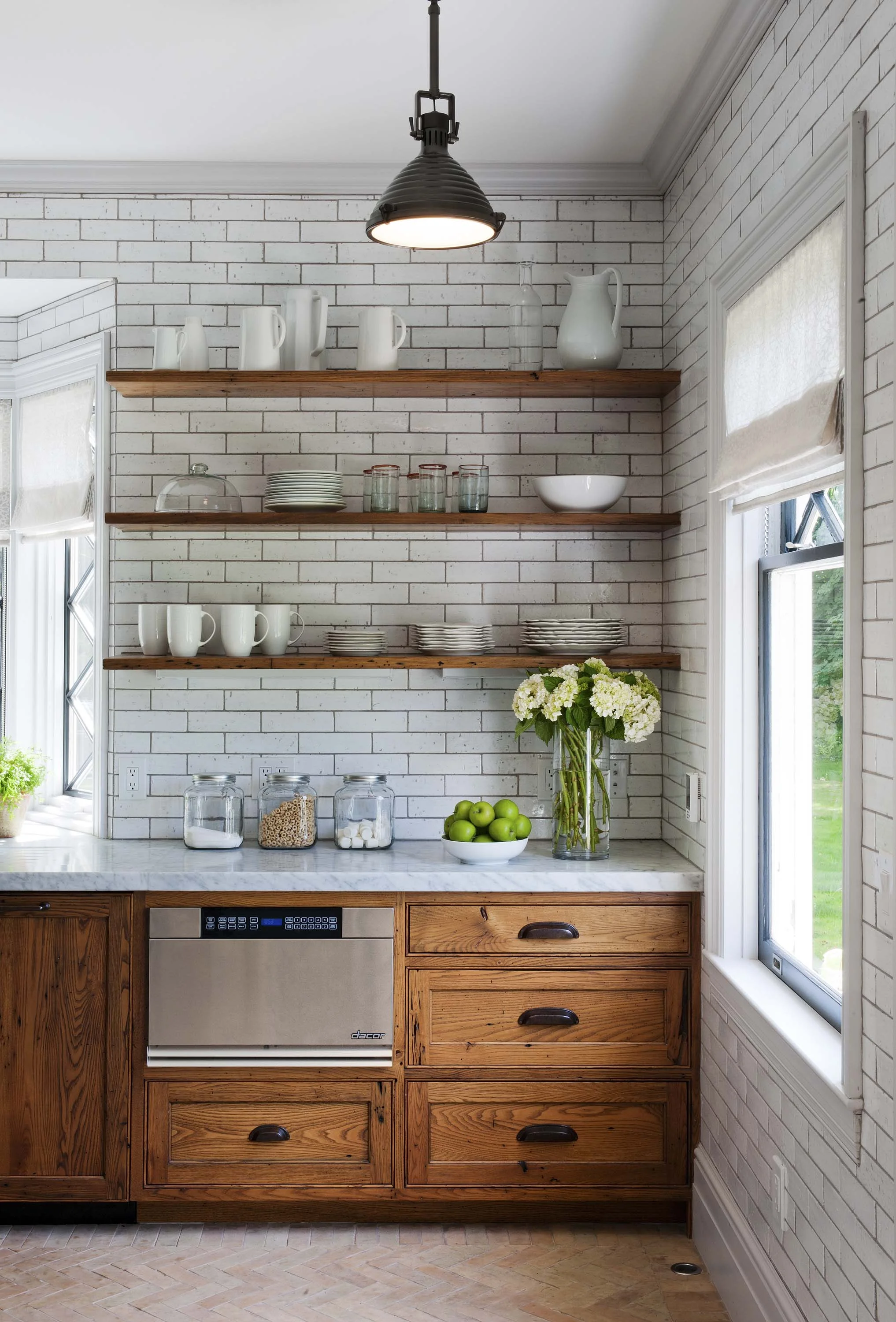
It took some digging, but i’m seriously digging these:

Source: Hometalk

Source: Hometalk

Credit: Lauren Liess via Country Living

Credit: Lauren Liess via Country Living

Incidentally, I recently shot my dear friend Jamie’s brown kitchen for my book; I loved how she brought campaign-furniture styling to her kitchen and modernized the look with brass hardware and brass-trimmed tile. It’s very glam, no?

Behind the scenes at our shoot.

Behind the scenes at our shoot.

So. What makes these good brown kitchens different from the ones everyone loves to hate? How do you make sure you end up with a fresh, updated look? A few tips:

  • Mix light and dark. The dark woods in the above kitchens are paired with light subway tiles, pale walls, opalescent white glass light fixtures, and other elements that help brighten the space. 
     
  • Keep the hardware simple. Whether bar pulls, knobs, or bin pulls, the lines are streamlined and sort of utilitarian-looking, which gives them that understated, farmhouse vibe.
     
  • Elevate it with a smart mix of materials. In the “old” brown kitchen, all of the accents matched, typically in a dull finish of brushed stainless steel. The new version mixes stained and polished wood with metal, glass, marble, oiled bronze, polished chrome, and more. 
     
  • Choose walls and floor finishes that feel crisp and new. Whether it's powder-blue plaster or sleek tile floors, there's an element of modernity in all of these rooms.
     
  • Incorporate a hit of color. Be it in the paint, the accessories, or fresh greenery, there's something vibrant somewhere in the space.

With all of this in mind, I threw together a mockup to show my friend how she might keep the existing cabinets and still get the fresh, modern-vintage farmhouse style she described wanting in her home. Have a look.

Corinn Ryan Kitchen.jpg

What do think? Are you anti-brown cabinetry, or could you see it coming back into style?

Featured: Inspiring Women Series on Cloud & Day

Fact: In my line of work—writing, styling, editing—I get to work with some pretty incredible women. One superstar I’ve had the pleasure of collaborating with a ton in the last 12 months is photographer Joyelle West, whose work has been featured by on Homepolish, Curbed.com, and on the cover of the Boston Globe Magazine. She’s done travel photography and weddings, which is how we met (I was the editor of Boston Weddings magazine and a contributor to New England Travel for a few years), but these days she's almost entirely focused on interiors. Joyelle is the sole photographer for my upcoming book, which means we spend a lot of time crouched behind a lens together.

Image credit: Joyelle West

Image credit: Joyelle West

Image credit: Joyelle West

Image credit: Joyelle West

Joyelle recently decided to start a series called “Inspiring Women” on her blog, Cloud and Day, and for the first installment, she asked me to answer a few questions about my work in this creative field. I was thrilled to oblige. A few nuggets I shared:

On staying inspired:

I’m lucky to get to visit other cities when collaborating with celebrities and bloggers on decor projects …. Going to the big trade shows for my industry, like High Point Market in North Carolina, always fills me with ideas, too. And when I’m traveling, I make a point to visit local restaurants and decor shops and take in aesthetic experiences that are different from what I see every day.

On shooting for my book:

[A]ll of the homes we photographed were styled by the homeowner and/or me; not a single one was put together by a trained interior designer, so they were living, breathing examples of what I’m encouraging readers to do. I’m urging people to embrace their innate design leanings, start putting things together using tips and tricks I’ve learned over time, and to stop treating decorating as this precious, pretentious thing. Anyone can do it, and it’s such an amazing way to express yourself.

Head over to Joyelle’s blog, cloudandday.com, to read the complete feature and to check out her amazing portfolio of interior photography. And if you have any other questions about my job, my weird and circuitous career path, or my book, shoot 'em over via the comment section!