Back in May, I shared one of the most exciting projects I’d be working on this year—the Real Simple Home. And I’m pleased as punch to FINALLY be sharing an official update… It’s done!!
But let’s back up. After the initial shock of excitement/joy/terror wore off, I spent the rest of May getting to work. The venue was revealed to be 550 Vanderbilt, a gorgeous new residential development in Brooklyn boasting incredible city views and luxe amenities. Our unit was a penthouse, which was partially complete but still waiting on some finishing touches. With kitchen cabinetry, flooring preselected and installed, my job was going to be adding a bit of personality to the space via décor, lighting, and a small amount of furniture, which I’d source from Joss & Main.
Fun and easy, right? Not so fast. My kitchen not only had most pieces already in situ, it was open and adjacent to the living room, which was being designed by Nate Berkus and Jeremiah Brent.
Wait, did you get that?
NATE BERKUS AND JEREMIAH BRENT. And, oh yeah, the other designers in the mix include Sabrina Soto (love her, and loved styling her for a catalog shoot last summer), Studio McGee (my be-all, end-all for clean-boho-rustic design inspiration), Jenny Komenda, Robin Henry, Ariel Okin of Homepolish, and Jessica McCarthy of Decorist.
Low stakes, right?
So let’s review this again. I needed to:
Build on what was already there.
Add a healthy dose of personality.
Make it functional.
Make it photogenic.
Shop it all from Joss & Main.
And for the love of God, DO NOT DO ANYTHING THAT WILL LOOK BAD NEXT TO THE WORK OF NATE BERKUS.
Uuunnnnggggghhhhhhhhh.
But since hyperventilating wasn’t going to get me anywhere, I decided to start where I always do: with measurements of the space and a room mockup. (Yup, the same tool I talk endlessly about in my book.) I had a couple of photos to work from, including this rendering of another unit from a real estate listing:
Source: 550 Vanderbilt
I kept these on my desktop as I began to shop for items that would bring life to the space, testing them out in my digital rendering of a room.
Here’s where I landed with my mockup.
Next, I took things a step further and mocked up what my stools and lights might look like at the island. A little birdie also told me that the walls were being painted a warm cream tone in Nate & Jeremiah’s space, so I included a swatch to ensure everything would flow.
By July, it was time to install. My team from Joss & Main and I headed to Brooklyn to unpack the goods, and we put up this awesome peel-and-stick wallpaper to give things a graphic, youthful spin.
Source: Joss & Main
That’s right, I said peel-and-stick. It’s removable, yo! Installing it was easy as pie, and took just about an hour to do a two-strip section of wall adjacent to the kitchen’s wine fridge.
Next, we tested out lots of different runners and decor to see how they might work together in the space.
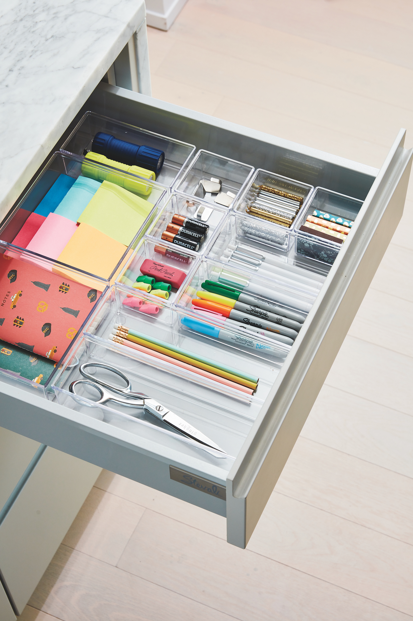
Meanwhile, the team at the organizing company Neat Method outfitted all the cabinets with great storage solutions. It IS Real Simple, after all.
Image credit: Christopher Testani
Image credit: Christopher Testani
The end result, which we’ll be celebrating at a launch party next week, is below. Not too shabby, right?
Image credit: Christopher Testani
Image credit: Christopher Testani
Of course, mine was only one of the spaces in the Real Simple Home—and you must, must MUST check out the others in the October issue of the magazine, on stands September 21!
If you’re in the NYC area, you can actually tour the space in person starting next week. Stay tuned to @real_simple on Instagram for updates and hours!
And if you’re looking to shop the products above, you can find them all (plus a few other complementary picks) right here.
What’s your favorite part of the space? Or do you hate it entirely? I’d love to hear your comments below.
xx


