Five Great Yellow Couches (+ Podcast News!)

A few weeks ago I had the pleasure of being interviewed for a podcast: Style Matters, by Zandra Zuraw of the decor-inspiration site Little Yellow Couch. Zandra started Style Matters to explore the meaning and real-life resonance of design, and over the years she’s interviewed such style luminaries as Justina Blakeney, Eddie Ross, Rebecca Atwood, and more.  

So when she asked to the tape a ‘cast with her, of course I said yes. During our half-hour chat, Zandra and I talked business, books, and why I think decorating is about far more than just making a room look nice. At one point I frankly forgot I was being interviewed—it was just two ladies talking about everything we love about design.

Have a listen over on Little Yellow Couch, or just click the link below to jump right in:

Meanwhile, I’m also using this as a cheeky excuse to talk about yellow couches. (Or sooooofas, if you’re in the design industry. I got major side-eye the first time I went to a home-decor show and—gasp!—called a sofa a couch.)

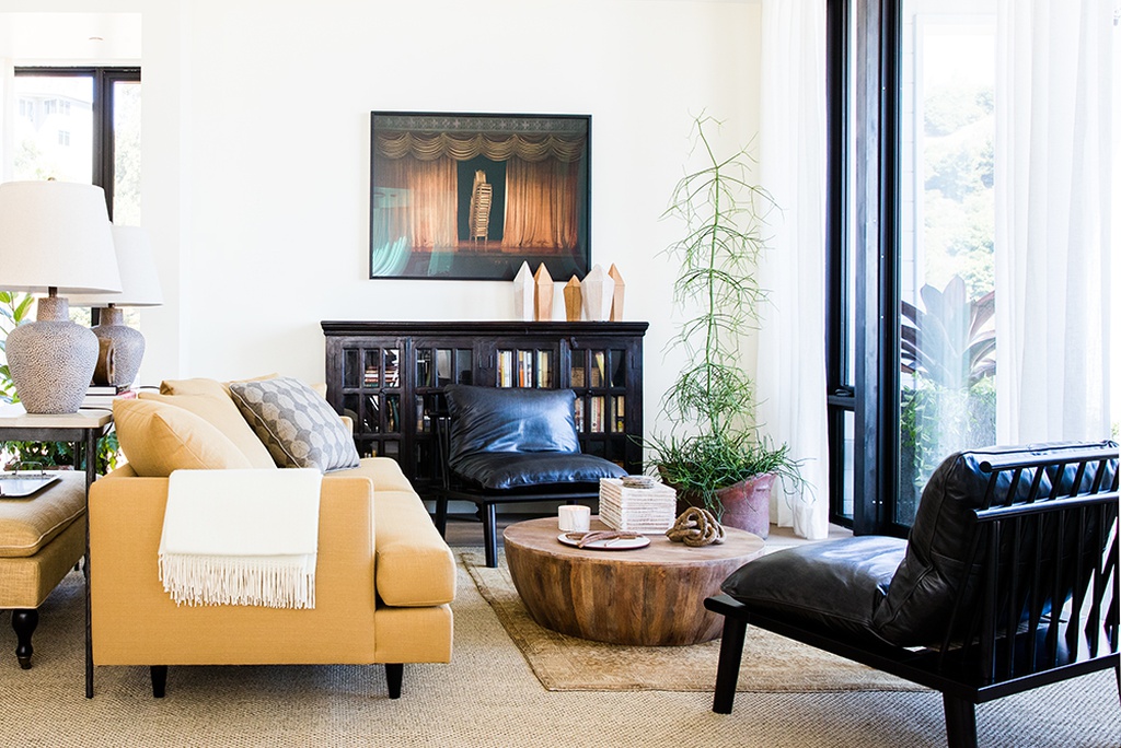
I’m not sure I’d go mellow yellow in my own home, but boy, have I seen some great ones in great spaces. Think you could pull off a look like this?

Or maybe this is more your speed:

This sunny sofa, in the former Brooklyn home of fashion icon Jenna Lyons, may have actually started the yellow-couch fever:

For giggles, here’s a handful of great sofas and chaises in shades ranging from sunny saffron to deep mustard. I love them all.

1. My Chic Nest Jess Loveseat, $1606, Perigold. 2. Denver sofa in Gold Velvet, $1,998, Anthropologie. 3. Matrix sofa in Yarrow Gold velvet, $1,299, Article. 4. Martinique tufted sofa in Mustard, $920, Joss & Main. 5. Loni M. Elaine chaise in Sun…

1. My Chic Nest Jess Loveseat, $1606, Perigold. 2. Denver sofa in Gold Velvet, $1,998, Anthropologie. 3. Matrix sofa in Yarrow Gold velvet, $1,299, Article. 4. Martinique tufted sofa in Mustard, $920, Joss & Main. 5. Loni M. Elaine chaise in Sunny, $1,900, Wayfair.

What say you: Do you take a shine to yellow furniture? Or does it leave you sour?

Watch Now: How to Personalize Any Kitchen—on a Budget

Friends! This week kicked off with a fun announcement—the official launch of the Real Simple Home. Today the magazine debuted a dedicated page full of project details, like the Nate Berkus and Jeremiah Brent-designed living room; the entry by Robin Henry Studio; bedrooms by Studio McGee and Decorist’s Jessica McCarthy; a tween room by Jenny Komenda, a laundry room by Sabrina Soto; an office by Homepolish designer Ariel Okin, and a terrace by RS’s own Stephanie Sisco.

But today they also published this video—a tour of the kitchen and all the little decorative details that didn’t make it into print. Have a look:

Believe it or not, we decided to shoot this at the last minute while I was in town with the Joss & Main team for the installation! And we shot the whole thing in just a couple of takes. See if you can spot the ladder and tools in the background… As I mention in the clip, we really did install this DIY wallpaper by ourselves in under an hour!

After seeing this “after”, do you think you’d tackle peel-and-stick wallpaper in your own kitchen? Anything in here that you’d definitely do/not do?

To read the full article, head over to Real Simple.

Real Simple Home: The Project Reveal!

Back in May, I shared one of the most exciting projects I’d be working on this year—the Real Simple Home. And I’m pleased as punch to FINALLY be sharing an official update… It’s done!!

But let’s back up. After the initial shock of excitement/joy/terror wore off, I spent the rest of May getting to work. The venue was revealed to be 550 Vanderbilt, a gorgeous new residential development in Brooklyn boasting incredible city views and luxe amenities. Our unit was a penthouse, which was partially complete but still waiting on some finishing touches. With kitchen cabinetry, flooring preselected and installed, my job was going to be adding a bit of personality to the space via décor, lighting, and a small amount of furniture, which I’d source from Joss & Main.

Fun and easy, right? Not so fast. My kitchen not only had most pieces already in situ, it was open and adjacent to the living room, which was being designed by Nate Berkus and Jeremiah Brent.

Wait, did you get that?

NATE BERKUS AND JEREMIAH BRENT. And, oh yeah, the other designers in the mix include Sabrina Soto (love her, and loved styling her for a catalog shoot last summer), Studio McGee (my be-all, end-all for clean-boho-rustic design inspiration), Jenny Komenda, Robin Henry, Ariel Okin of Homepolish, and Jessica McCarthy of Decorist.  

Low stakes, right?

So let’s review this again. I needed to:

  • Build on what was already there.

  • Add a healthy dose of personality.

  • Make it functional.

  • Make it photogenic.

  • Shop it all from Joss & Main.

  • And for the love of God, DO NOT DO ANYTHING THAT WILL LOOK BAD NEXT TO THE WORK OF NATE BERKUS.

Uuunnnnggggghhhhhhhhh.

But since hyperventilating wasn’t going to get me anywhere, I decided to start where I always do: with measurements of the space and a room mockup. (Yup, the same tool I talk endlessly about in my book.) I had a couple of photos to work from, including this rendering of another unit from a real estate listing:

Source: 550 Vanderbilt

I kept these on my desktop as I began to shop for items that would bring life to the space, testing them out in my digital rendering of a room.

Here’s where I landed with my mockup.

Real_Simple_Donna_Garlough_room_mockup

Next, I took things a step further and mocked up what my stools and lights might look like at the island. A little birdie also told me that the walls were being painted a warm cream tone in Nate & Jeremiah’s space, so I included a swatch to ensure everything would flow.

Real_Simple_Home_kitchen_plan.jpg

By July, it was time to install. My team from Joss & Main and I headed to Brooklyn to unpack the goods, and we put up this awesome peel-and-stick wallpaper to give things a graphic, youthful spin.

Source: Joss & Main

Source: Joss & Main

That’s right, I said peel-and-stick. It’s removable, yo! Installing it was easy as pie, and took just about an hour to do a two-strip section of wall adjacent to the kitchen’s wine fridge.

Next, we tested out lots of different runners and decor to see how they might work together in the space.

Real_Simple_Home_Joss_and_Main

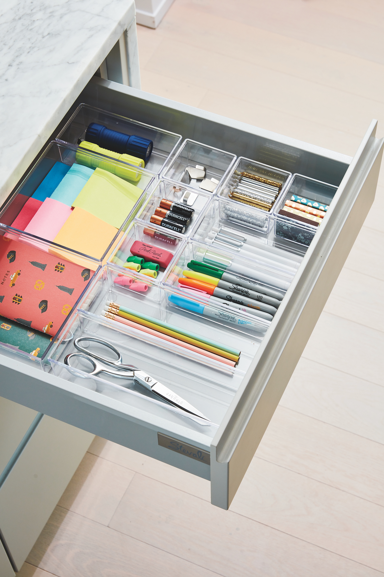
Meanwhile, the team at the organizing company Neat Method outfitted all the cabinets with great storage solutions.  It IS Real Simple, after all.

Image credit: Christopher Testani

Image credit: Christopher Testani

Image credit: Christopher Testani

Image credit: Christopher Testani

The end result, which we’ll be celebrating at a launch party next week, is below. Not too shabby, right?

Image credit: Christopher Testani

Image credit: Christopher Testani

Image credit: Christopher Testani

Image credit: Christopher Testani

Of course, mine was only one of the spaces in the Real Simple Home—and you must, must MUST check out the others in the October issue of the magazine, on stands September 21!

If you’re in the NYC area, you can actually tour the space in person starting next week. Stay tuned to @real_simple on Instagram for updates and hours!

And if you’re looking to shop the products above, you can find them all (plus a few other complementary picks) right here.

What’s your favorite part of the space? Or do you hate it entirely? I’d love to hear your comments below.

xx

Featured! My home in Rue Magazine

If you follow me on Instagram, you might have seen a few of these pics in the last month. But I wanted to share a link to possibly the most-fun feature I’ve ever been a part of: a Q&A and home tour in the beloved online design magazine, Rue!

The feature landed earlier this summer, and it’s still live here. Here’s a sneak peek of what’s inside. Photographs are all by Allison Sepanek.

Rue_Magazine_Feature

They even included a few of my real-life design tips, and featured pieces from my new ceramics collection with Jill Rosenwald!

Rue_Magazine_Design_Tips

If I’m being totally honest, these spaces are usually much more lived-in than they appear in this feature. We use every inch of our house, and our counters are usually topped with all manner of construction-paper art projects, pipe cleaners, breakfast dishes, and mail. But whose aren’t? In any given month, these rooms look like the above pics approximately twice, for about twenty minutes at a stretch—and never at the same time. I did manage to sneak in some reminders that people live here, though. Who can spot the Beanie Boo owl on page 21?

Head on over to Rue to read the full story.  And huge thanks to editor Kelli Lamb for the beautifully produced feature!

IMG_5647.JPG
IMG_5646.JPG

Me + ​Real Simple = OMG

Real_Simple_July_2018_cover

I’m mayyyyyybe going out on a limb here, but if you’re reading this blog, I’m guessing you’ve heard of the magazine Real Simple. I remember when it launched in 2000—I was a magazine intern at the time, and I thought, “Holy crap. A magazine that’s all about how to make things easier, not just fancier/better/prettier/[insert comparative adjective here]. Why has nobody done this before?”

Real Simple pretty much invented the home hack. I’ve been a reader from the beginning, even contributing a tip or two to the magazine now and then. My 2016 makeover of a Bachelor couple's space was featured on their website, too. 

So it’s extra-exciting to share some news this month: I’ve been tapped to style the kitchen of the Real Simple Idea Home, a project that’s going to be revealed in full in their October issue! A teaser appears in the July edition:

What's the Real Simple Idea Home? In short, it’s a real-life residence that’s going to be full of “aha” moments, from smart decorating ideas to budget-stretching solutions. Each space is being furnished and decorated by a different brand or designer. Being Real Simple, there’ll naturally be tons of storage tips as well, courtesy of the organizing team at Neat Method. There is an INCREDIBLE roster of design talent on board for the project, which I won’t share yet... Just know that I’m floored to be in the mix!

Right now I’m still tinkering with the design. Given my job at Joss & Main, I’ll be filling the space with lots of budget-friendly kitchen items and decorative touches from the website.

You’ll have to wait until late September for the full reveal, but for now, click here to read a teaser from the issue now on stands: "5 Pro-Approved Ways to Make a Small Kitchen Look Bigger."  The kitchen pictured in the article is my own, photographed by Joyelle West for my book (link to purchase here). And pick up a hard copy before it’s gone!