Wanted: A Four-Bedroom Kondo.

When it comes to home and lifestyle trends, I’ll admit I'm not the earliest adopter. I didn't try the South Beach Diet or Master Cleanse until years after every fitness magazine had written about it; I didn’t catch on to the Real Housewives until a few seasons of OC had passed. I still haven't picked up an adult-coloring book. (Talk about a fast-moving trend... Any day now, some cheeky publisher is going to come out with a literal “adult coloring book” that’s completely NSFW.)

Part of it is wanting to see a trend prove out before I jump on the bandwagon, or not have to compare myself to the legions already self-discovering through the latest fad. Which is how I came to devour a copy of professional organizer Marie Kondo’s book The Life-Changing Magic of Tidying Up on a 4.5-hour flight home from Salt Lake City two weeks ago. The sequel, Spark Joy, is already flying off bookshelves, and my curiosity finally got the better of me. 

Your guide to Kondo living. $10, Amazon.


Your guide to Kondo living. $10, Amazon.

The weekend after I read the book, I filled three trash bags with clothing to donate and discard. This past weekend, I filled two more. I’ve plowed through the contents of three closets, re-folded every one of my sweaters and socks, and freed up massive amounts of storage space. My closet now looks like this:

Two weeks ago, all of those empty hangers held clothes.


Two weeks ago, all of those empty hangers held clothes.

Shirts and sweaters are folded and "filed" vertically.


Shirts and sweaters are folded and "filed" vertically.

Handbags and clutches are stacked so I can easily identify each one in profile (or by its protective dust cover).


Handbags and clutches are stacked so I can easily identify each one in profile (or by its protective dust cover).

I have this strange feeling that, unlike my previous clutter purges, my things are going to stay this way. Getting packed and unpacked from a business trip following the re-org was unbelievably easy; so is getting dressed every morning. I’m a convert.

Vertically-filed pajamas and loungewear, post-Kondo purge.


Vertically-filed pajamas and loungewear, post-Kondo purge.

BUT. There’s one aspect of Kondo’s method that I have doubts about: the mandate that one must declutter a house in full. She instructs readers to winnow one's belongings all in one go, no exceptions. First you do the clothes (every piece you own), followed by your books, then other categories of belongings like papers and mementos, subjecting every piece to her kooky but effective “does it spark joy?” test. This process can supposedly be completed in six months. She is adamant about this all-or-nothing schedule of organizing category by category. Going room by room is no-go.

I don’t have six months to spend organizing. Even if I believed the process would yield me a bigger-feeling house, self-actualization, and a skinnier ass, I cannot dedicate 26 consecutive weeks of 2016 to this process. And with a full-time job, bedrooms on four floors, two kids whose sleep schedules don’t leave me many opportunities to rifle through their closets undisturbed… IT AIN’T HAPPENING, MARIE.

So I’m exploring: Is it possible to do a modified Kondo? Instead of tearing through my house looking for every last article of kids’ clothing, can I do an initial purge and then apply her vetting and organizing techniques to my belongings as I encounter them? In other words, is there a denomination of Kondo-ism that lets me continue the progress I’ve made in a way that works for my crazy life? 

Marie Kondo proudly boasts that no client has lapsed after following her carefully prescribed purge, so perhaps modifying is damning... Maybe I'm just setting myself up for a future of coin-littered bedside tables and drawers full of unmatched socks. But I can't know until I try.

Meanwhile, Kondo also rails against the purchase of so-called organization aids like baskets and plastic bins. I totally get why she does; you can't solve the problem of stuff with more stuff. But here are three pieces I found helpful in the Kondo-style conquering of my own clutter. Maybe they'll help you, too. 

1. The shallow, open-top basket.

Helps me file folded clothes vertically while leaving enough of each garment exposed so I can identify what I'm looking for. These work especially well for tees, folded jeans, and sweaters (but beware baskets with rough fibers that will catch on knits).


2. The multipurpose box.

Can be used inside a drawer to corral smaller items, like tights and underthings. I also use these all over the house to store kids' toys, because they're stackable and allow the kiddos to easily ID what's inside. 

3. An under-bed shoe bin. On wheels.

Kondo seems generally opposed to any storage solution that keeps your belongings out of sight, as those belongings are more likely to become forgotten clutter. But with the seasonal weather shifts we see in New England, I don't see how I can't maintain some deep, put-away storage for my out-of-season kicks. I like these wheeled boxes with picnic-style lids far better than the canvas shoe-storage bags I've used in the past, because the contents of the latter so easily jumble when you're cramming the bag back under the bed. I'll take two, please.

Who knows? Maybe this is terrible advice and you should all do exactly as the joy-sparking guru says. But perhaps my late-to-the-game adoption and modifications of the KonMari method will lead me to my own revelatory, life-changing discoveries. Maybe I’ll be that cult member who starts a new sub-cult and takes you all with me, Jerry Maguire-style. We'll spark our own joy, goddamnit!  WHO'S COMING? HUH? WHO'S COMING??

Or maybe I'll just keep folding my socks into sixths. I'll let you know. 

Secrets of a Style Director: What I'll Never Buy for My Own Home

OK, guys, it’s confession time. I’ve just returned from Alt Summit, the annual design bloggers’ conference in Salt Lake City, where I was schmoozing on behalf of Joss & Main. Between booth sessions and lots of posing for our #whitesofachallenge, however, I was able to pop into some of the breakout sessions and roundtables on blogging and design.

After hours of talks on creativity, finding your voice, and #authenticity, I decided I needed to let a skeleton or two out of my own closet from time to time. So today I’m here to tell you all that I…

Um. 

This is really hard. Let me try again.

See, ever since I was in college, I [cough]....

Ugh. You know what? Fuck it.

I only buy neutral-colored toiletries.  

I'll let that sink in for a moment. I’m a mess, am I not? But seriously, I simply do not possess the ability to buy a bottle of Garnier Fructis shampoo. Walking through Sephora or CVS, I mentally whittle the selection down to only those bottles I’d be willing to put on public display, and only then can I begin to comparison shop. 

Want proof? Here’s my shelf in the shower. (It’s getting real, folks.)

image.jpg

​Here's what's around my sink.

image.jpg
image.jpg

Not everything I own is pure white, gray, taupe, or black. Translucent colors, pastels, metallics, or pops of color on the label are OK if the overall look is clean and tailored, e.g. Molton BrownDr. Hauschka, or Fresh.  But the overall effect is neutral. Like, barely-notice-anything's-there neutral.

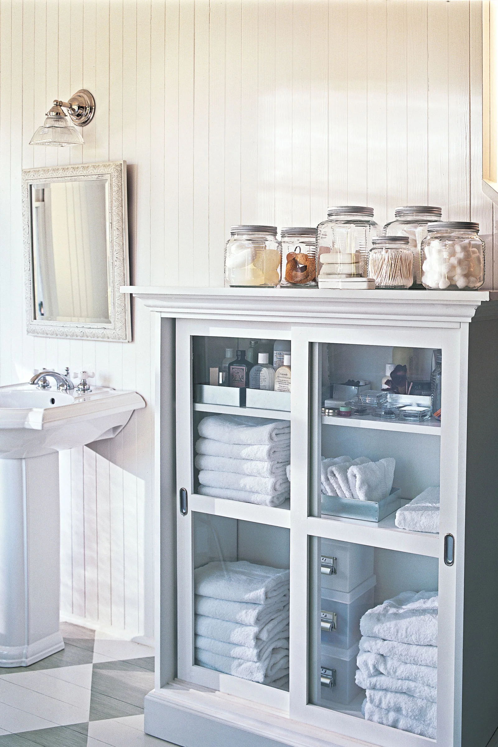
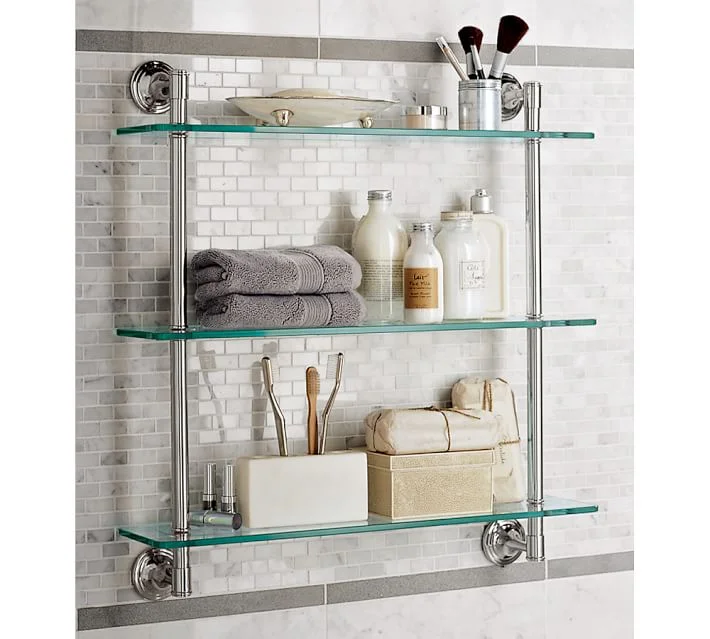
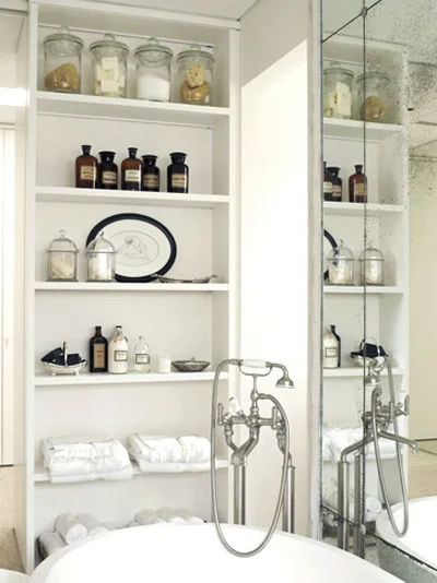
Where did this weird compulsion originate? It may have come from my early obsession with lifestyle magazines and home-furnishings catalogs, and me wishing that I’d one day have a bathroom that looked as put-together and well-edited as this:

Source: Domino magazine via Pinterest


Source: Domino magazine via Pinterest

Source: Pottery Barn


Source: Pottery Barn

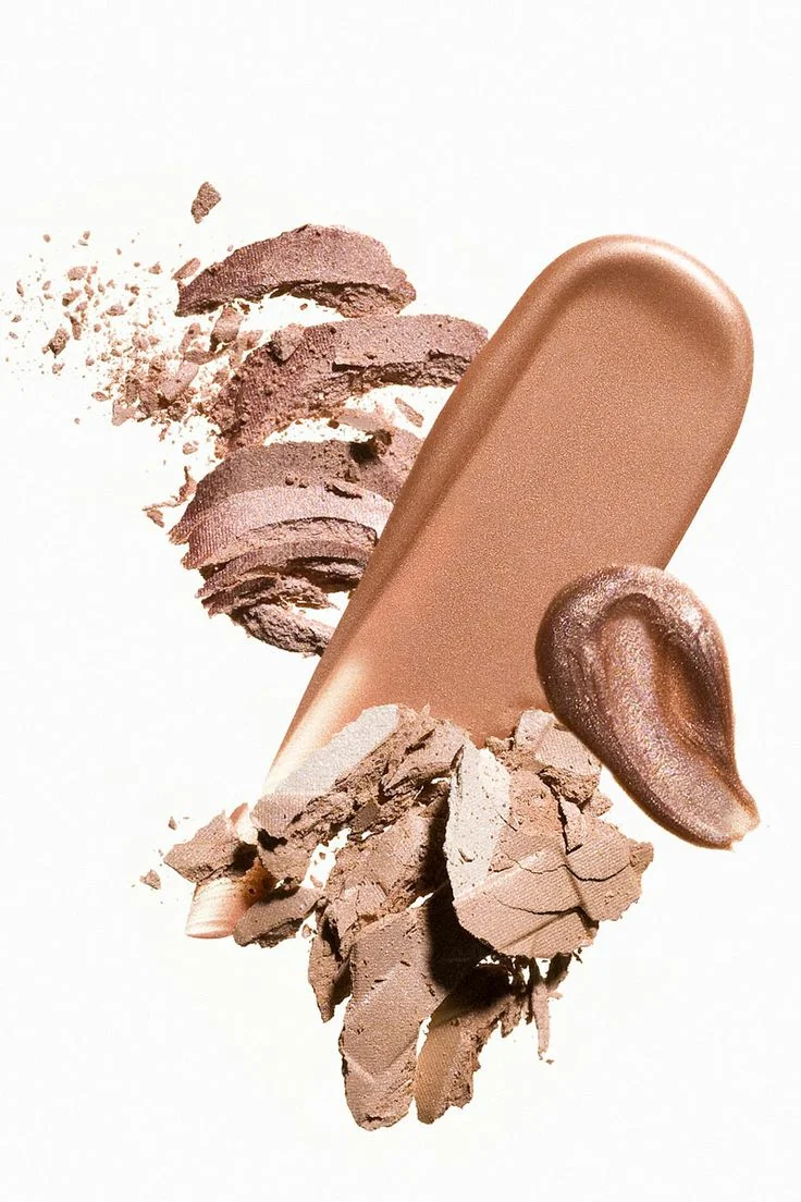
It could have been my stint as a beauty editor at Whole Living magazine, where I had to find products that were not only eco- and health-friendly but also had packaging pretty enough to photograph. A lot of the time, we had to shoot the organic beauty products in unwrapped or deconstructed form because the packaging was so detestable, not unlike this:

Source: Pietro Scordo Photography via Pinterest


Source: Pietro Scordo Photography via Pinterest

Source: Greg Broom Photography via Pinterest


Source: Greg Broom Photography via Pinterest

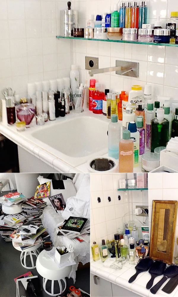
Or perhaps it’s all of the time I’ve spent writing and thinking about well-designed homes, not to mention renovating my own. To me, a bathroom just looks so much better when it’s not cluttered up with ugly drugstore cosmetics, which are purposely designed to scream at you from the shelves. If you’re going to put all this work and money into choosing tile and faucets and finishes, I say, why muck up the look with piles of fluorescent-colored plastic?

Karl Lagerfeld's bathroom. I'm not sure we could be friends. Source: Harper’s Bazaar via Guest of a Guest


Karl Lagerfeld's bathroom. I'm not sure we could be friends. Source: Harper’s Bazaar via Guest of a Guest

It's so much better this way, isnt' it?

I’m moving in. Image via Shelterness


I’m moving in. Image via Shelterness

Buying only neutral products also allows me to be a little lazy. While I like to imagine I could commit to a Marie Kondo-like routine of putting every product back in its place after every use, owning mostly neutral items means I can leave my moisturizers and serums and things out on the sink from time to time and not see a mess.

I’ve read advice from professional organizers and in magazines about transferring products from ugly containers into pretty, uniformly sized ones to keep your bath looking clean, but that’s always struck me as an expensive and annoying extra step. It also makes it hard to check the product’s ingredients, which can be really important if you have sensitive skin or a health condition, or to find out when a product has expired.

Does this neutral-only restriction ever cause me issues? For sure. There are times when I want to buy the citrus-scented facial scrub, but ultimately can’t put the chartreuse-colored bottle in my cart. The exception is when it'll fit in my medicine cabinet, but most bath & body products are too large. Know this: You’ll never find a bottle of aquarium-themed Softsoap on my sink, a Yankee Candle in my powder room, or a stack of Irish Spring on my open shelves, even if I liked those things. I'm a ruthless packaging snob, and now I'm admitting it to everyone. 

What about you? Are there any products you’re ultra-picky or weird about, for reasons other than the usual ones? ‘Fess up in the comments, and help me feel a little less weird...

How I Build a Room Mockup (a.k.a Mood Board)

Lately several friends and coworkers have asked me what software and processes I use to start a room mockup, a.k.a. mood board, a.k.a. a visual room plan. Mockups are a tool I use all the time, both for brainstorming new looks for our team to sell on Joss & Main, and for keeping my renovations and décor projects on track. It’s so helpful to see all of your ideas in one place, and to have a visual north star of sorts to guide you when you’re in a store and getting distracted by a million pretty things. A mockup reminds you where you want to be.

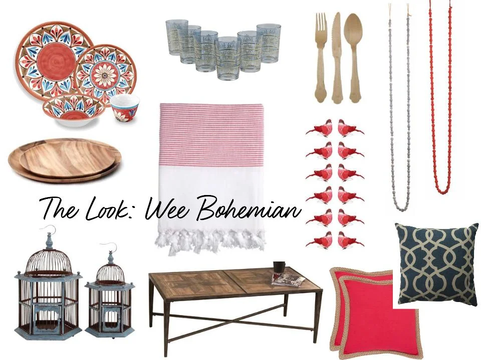
 A mood board I created for a holiday kids’ table concept on Joss & Main. Click through for the pics!


A mood board I created for a holiday kids’ table concept on Joss & Main. Click through for the pics!

My favorite tool for making said mockups, owing mostly to my lack of graphic design prowess, is Google Drawings. Not only is it absurdly easy to use, it lets me save all my mocks on Google Drive, where I can access them from anywhere I have an Internet connection. Other people I know create visual design boards in Photoshop, Illustrator, or even an Excel sheet. There are also lots of mood board-creation sites like Olioboard, Niice, or SampleBoard. You can use whatever floats your boat.

What about Pinterest? you might ask. Let me pause here and say that while I love Pinterest for gathering inspiration, as a planning tool I find it falls short, because it’s hard to see how all of your chosen items relate to one another in terms of silhouette and scale. It's just not contextual enough.

My mockups often look very much like the finished space or setup I'm planning create, because I try to make them reflect the balance of textures, patterns, and colors you’ll find in the end product. For instance, if I’m designing a dining room with six upholstered chairs, I like to see six upholstered chairs in the mockup, not just one.  At the very least, I’ll enlarge the fabric swatch in the mood board to reflect how much of that color and pattern there will be in the room relative to everything else. This will help you see if the whole space has too much going on, looks bland, etc.  If you have a big zebra print on eight dining chairs, that’s going to create a whole lot more noise in the room than just one zebra-print chair, and you want to account for that as you choose other items for the space.

Whatever the platform, I like to start by taking items that you own or are certain you’ll purchase and drop them (or their online doppelgangers) into the board, along with any items and images that really capture the vibe you like. These will become the "fixtures" you make your other selections around.

Note: These anchor pieces DO NOT have to be large pieces of furniture! A mockup can start with anything you like—even a photo that’s not from the world from home décor.

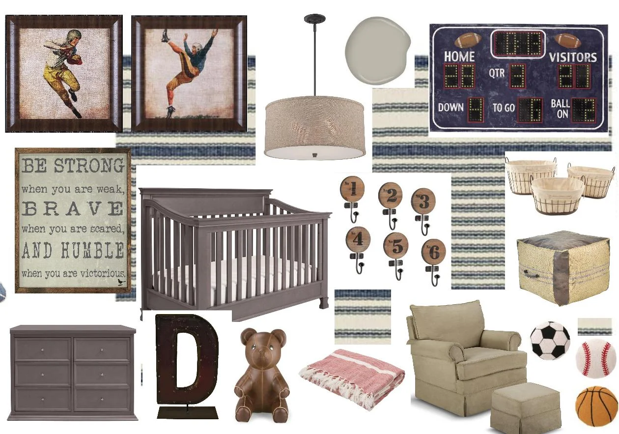
 This mockup, which I created for reality-star and country singer Jessie James Decker’s nursery, started with the framed vintage-sports prints. See the resulting room here on People.com.


This mockup, which I created for reality-star and country singer Jessie James Decker’s nursery, started with the framed vintage-sports prints. See the resulting room here on People.com.

They key is that the inspiration items NEED to have a vibe or color. It’s hard to start a mockup around a vague concept, like “vintage” or “Scandinavian,” for example, or a plain white sofa (unless it has some sort of cool detail that you can begin to make other product decisions against).  To me, the process doesn’t begin until your board has a piece with some life in it, whether it’s a vintage find or a piece of art or a pillow. Materials are good, as are patterns and fabrics. Anything that sends a visual cue, or that you can place another image, color, or product next to and say “I think that goes,” or “wow, that looks terrible," is a good starting place.
To give you an example of how this process works for me, let's look at a scheme I pulled together for my friend Jamie's office. She recently switched jobs and emailed me: Have been assigned new office/closet-- tiny, no window, institutional!  the interns used to be in here.  all the furniture has to be fire-rated. must enliven, what do you think?  rug, lamps?  mirror?! 

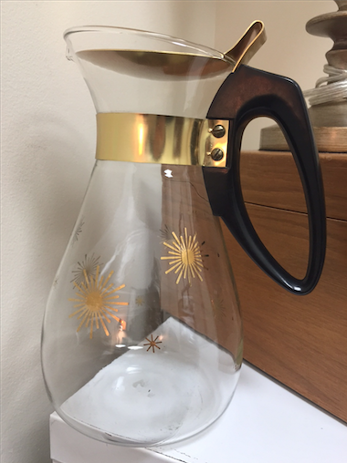
Jamie wanted a welcoming yet not-too-stodgy vibe. And she had a somewhat oddball pair of items she was hanging onto as inspiration: a vintage Pyrex pitcher with gold starburst details, and a black spindle-back chair she’d bought on a whim at a flea market and was thinking of repainting.

 The office inspiration—seriously.


The office inspiration—seriously.

She also had some cute glam-ish desk accessories and wall art she’d picked up with some store credit online. Starting with those cues, and knowing that Jamie has a slightly Eastern/boho side to her style (she’s half-Asian, like me, and loves a lot of the same Oriental motifs I do) I began building a board.

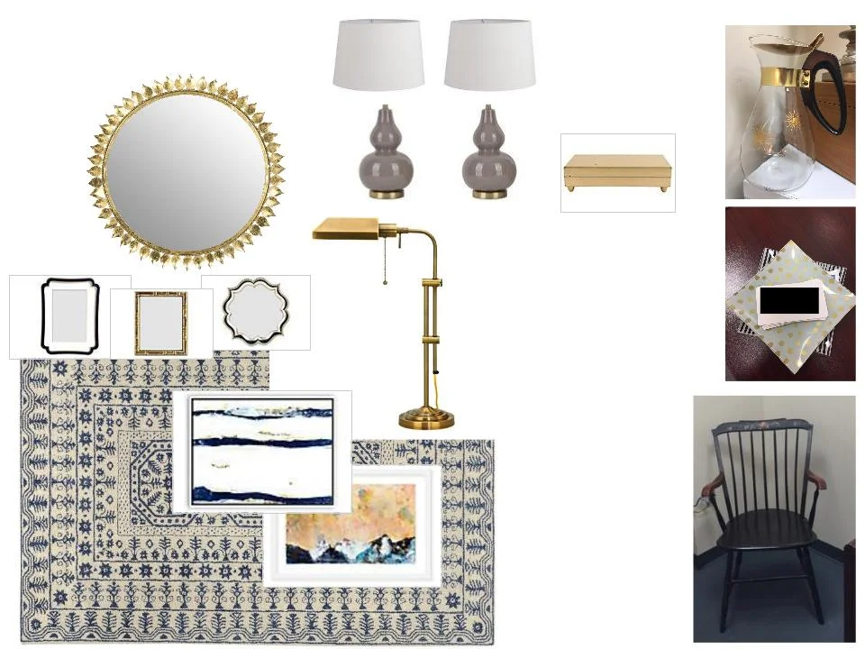
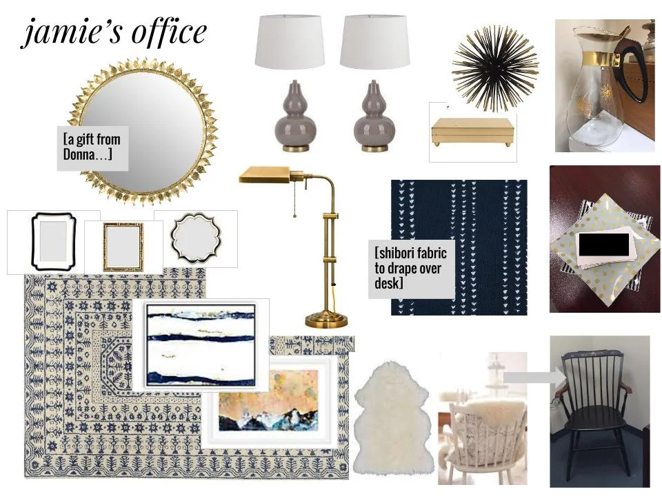
First, I took pictures of her Pyrex pitcher, trays, chair, and accents and dropped them in to a blank Google Drawing. I added a big indigo-toned rug that would bring some softness to the very utilitarian space, and a gold sunburst mirror to add some glamour and reflect light in the room.  A couple of table and task lamps would illuminate the space enough that she could leave the overhead fluorescents off.

Jamie's office in progress

Next we had to tackle her desk, which was a standard-issue doctor’s office particleboard masterpiece. I suggested draping it with some indigo shibori fabric, which would break up the swath of faux-cherry veneer, and I brought in some accents to complement the trays she already owned.  A sheepskin throw to cover the outdated flower detail on the chair, a funky urchin objet, and BOOM. We have a pretty cool office setup, don’t we?

Jamie's office

I’d love to hear what tools/starting points others use to create mockups or mood boards. If you’re not a designer, how feasible does this process seem to you? I’d love to hear your take in the comments section. Do tell…

Obsessed With... Horns and Hooves

Maybe it started with all the horn accessories I saw at home shows over the last few years. Maybe it was that blasted ram’s head table, which I still haven’t bought and am now second-guessing for its size. But suddenly I feel like I’m being followed by a flock of bighorn sheep, with a few gazelles and goats tagging along behind. They’re on my Pinterest feed, in magazines, and even my email inbox.

The experience—noticing a detail, then suddenly seeing it everywhere—is one I have often in this industry, and it’s not unlike what happened when I was a food writer. A chef would bring out a dish with black garlic, and suddenly I couldn’t go out to dinner without seeing a dish with black garlic. Black garlic for everyone!

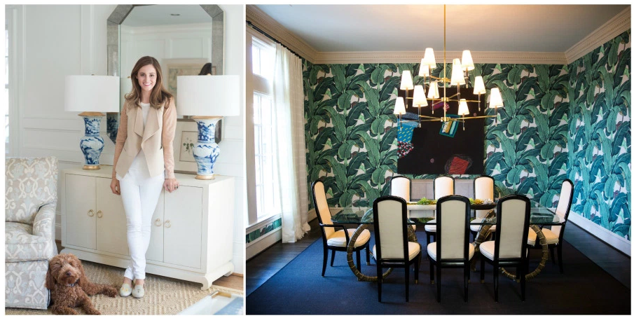
But back to the rams. This week, I spotted this design by Amy Berry via Viyet, anchored by a Hollywood Regency-style ram’s head table topped with glass. 

 Credit: Design by Amy Berry, via Viyet. This room also features the famous Martinique wallpaper found in the Beverly Hills Hotel, a print that everyone in the blog world is currently cray-cray for.


Credit: Design by Amy Berry, via Viyet. This room also features the famous Martinique wallpaper found in the Beverly Hills Hotel, a print that everyone in the blog world is currently cray-cray for.

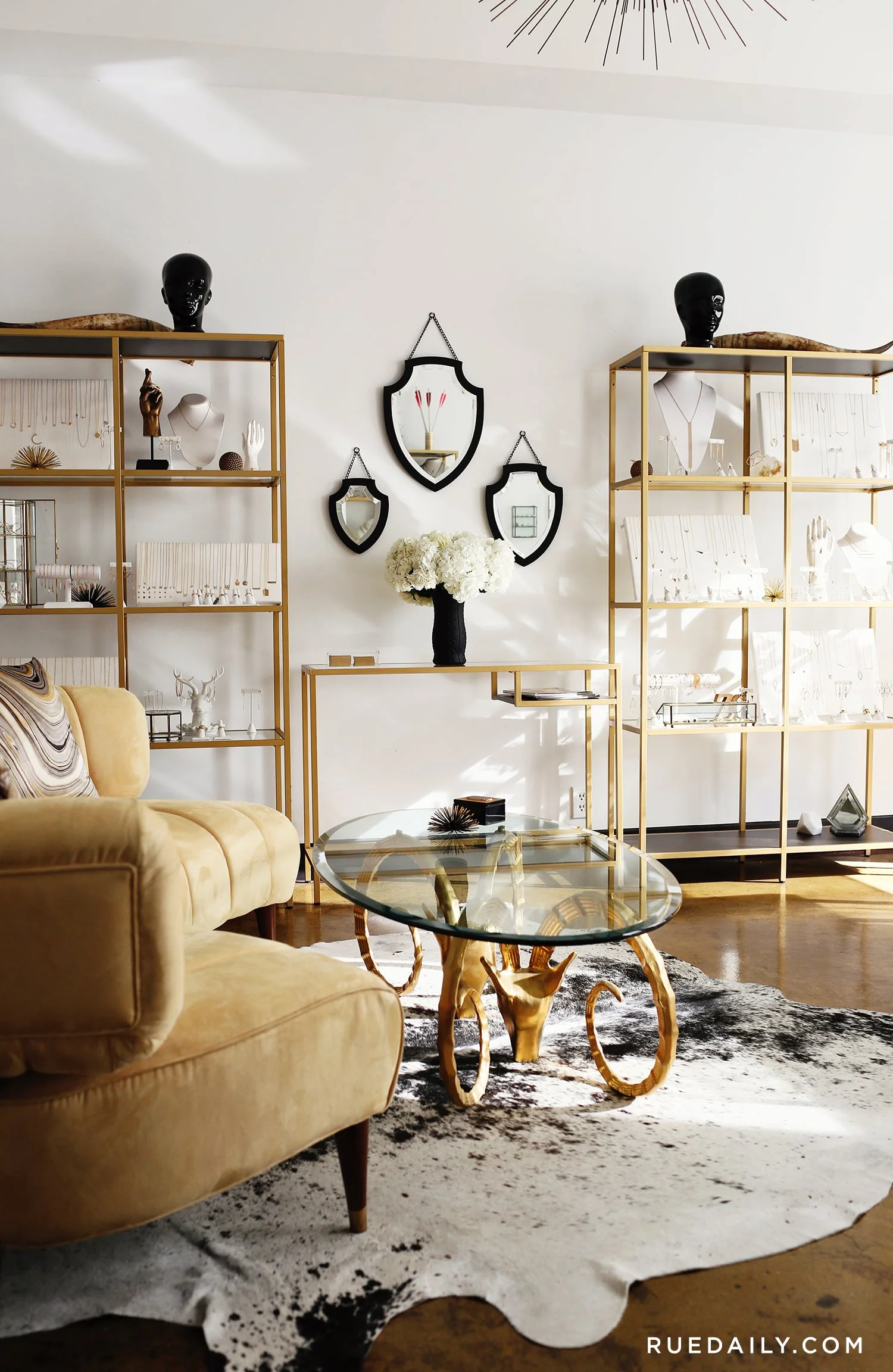
Then the online magazine Rue brought me this airy-yet-glam space from jewelry designer Zoe Chicco, featuring a cocktail-sized version of the same table. 

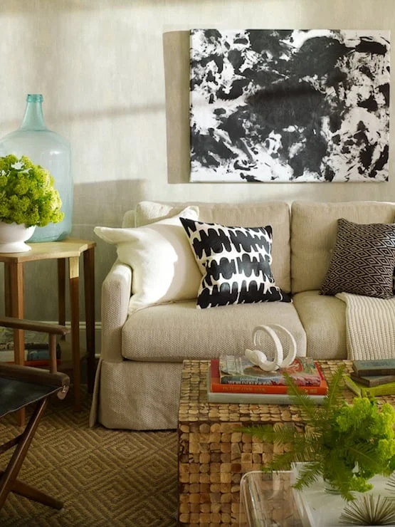
And then, of course, I realized that the gorgeous design tome Habitat by Lauren Liess, which I’ve been poring over for weeks, is full of horns and rammy things...

 Credit: Designer Lauren Liess, author of Habitat and the blog Pure Style Home


Credit: Designer Lauren Liess, author of Habitat and the blog Pure Style Home

...and all of a sudden I’m shopping for ram’s head bookends and hoof-shaped paperweights and vintage zoological prints of curly-horned sheep and holy hell I need to stop before a nymph jumps out of my bedroom closet with a pan flute.

For now, I might just indulge my fixation by printing and framing this illustration that I found in the New York Public Library’s Digital Collections.

 Source: NYPLDC


Source: NYPLDC

(Note: If you haven’t heard of the NYPL Digital Collections, go check ‘em out tout de suite. A few years ago the NYPL put their archives online, and you can now access over 600,000 fascinating images including botanical, ornithological, and zoological prints, for free. You can print them yourself or order higher-quality prints via the website. It’s a great way to fill out a gallery wall on a budget.)

Ready for more horns and hooves? Let’s shop.

Normal
0


false
false
false

EN-US
JA
X-NONE


 <w:LatentStyles DefLockedState="false" DefUnhideWhenUsed="true"
DefSemiHidden="true" DefQFormat="false" DefPriority="99"
LatentStyleCount="276">…


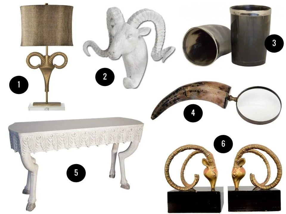
1. Nairobi table lamp, $400, Wayfair. 2. Dugaleon wall hook, $54, Wayfair. 3. Tyrol horn cups, $22 each, Jayson Home. 4. Horn magnifying glass, $29, Joss & Main. 5. Noir Furniture Pegas console table,  $1,332, Zinc Door. 6. Pair of ram’s head bookends, $475, 1stdibs

The One Piece That Can Change a Whole Room

An old, dear friend asked me for some help picking out lighting fixtures for her apartment recently, and as we went through long lists of options, it occurred to me that one thing most non-designers don't often filter for until they're ready to buy is size. Sure, the shape and finishes are everything, but how BIG is that sucker you'd like to dangle in the middle of your bed/living/dining room? Is it big enough to make the statement you want it to make?

Ninety-nine percent of the time, I say go big or go home. A pet peeve of mine is the undersized pendant fixture—in fact, it's the number-one thing I complain about when looking at homes for sale on Redfin or House Hunters or whatever. "Whyyyyyyy did they choose that dinky little fixture? It looks like dollhouse lighting!" I'll shout at my screen.

An oversized pendant or chandelier, on the other hand, can make such a HUGE difference and really elevate a room. Need proof? Here are five of the most epic oversized-lighting moments I've seen recently that prove an oversized pendant is EVERYTHING. 

1. The Room-Balancing Globe

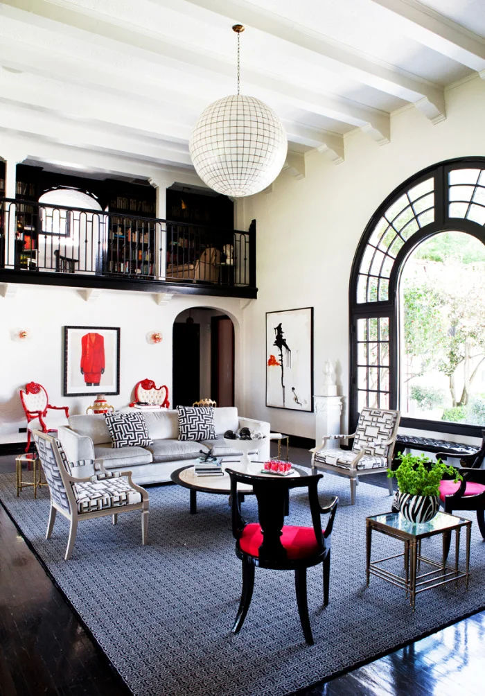
Credit: Design by Tamara Honey; image via Rue magazine


Credit: Design by Tamara Honey; image via Rue magazine

What's a poor girl with soaring ceilings to do? If you're designer Tamara Honey, you dangle a big orb of a thing right in the middle, showcasing the amazing height of the room. At the same time, by hanging the fixture well below the roof line, she helps to fill out the space, offer a glimpse of eye candy to anyone on the second floor, and bring the "top" of the room down a bit closer to the furniture, which helps the occupants feel less like bottom dwellers in a (very glamorous) ocean. 

2. The Organic Beauty

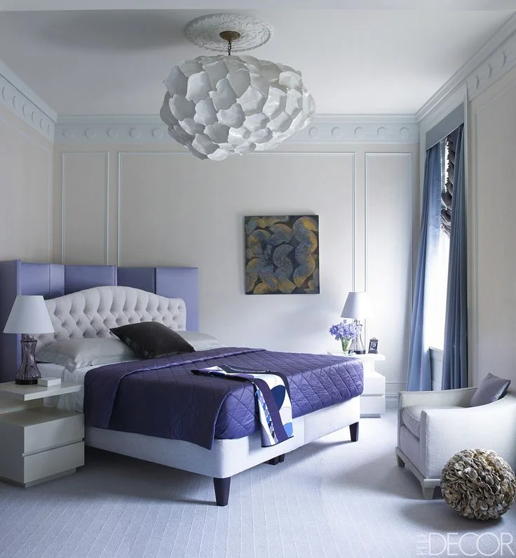
Credit: Chandelier by Christopher Trujillo; Desgin by Stephen Sills. Via Elle Decor.


Credit: Chandelier by Christopher Trujillo; Desgin by Stephen Sills. Via Elle Decor.

Designer Stephen Sills placed this amazing, one-of-a-kind pendant by artist Christopher Trujillo in a bedroom, and it's made of.... PAPER PLATES. Yes. I became instantly obsessed when I saw this shot via Elle Decor, and it very nearly inspired me to create my own version of paper-goods lighting. But then I thought about fire hazards, and staple wounds, and, you know, climbing a ladder, and then trying to explain to my husband why we need a Costco membership ("because they have the GOOD paper plates!"). So instead I just watched this video of the artist putting one together, and fantasized about hiring him to make a proper one for me. It's mesmerizing.

3. The A+ in Geometry

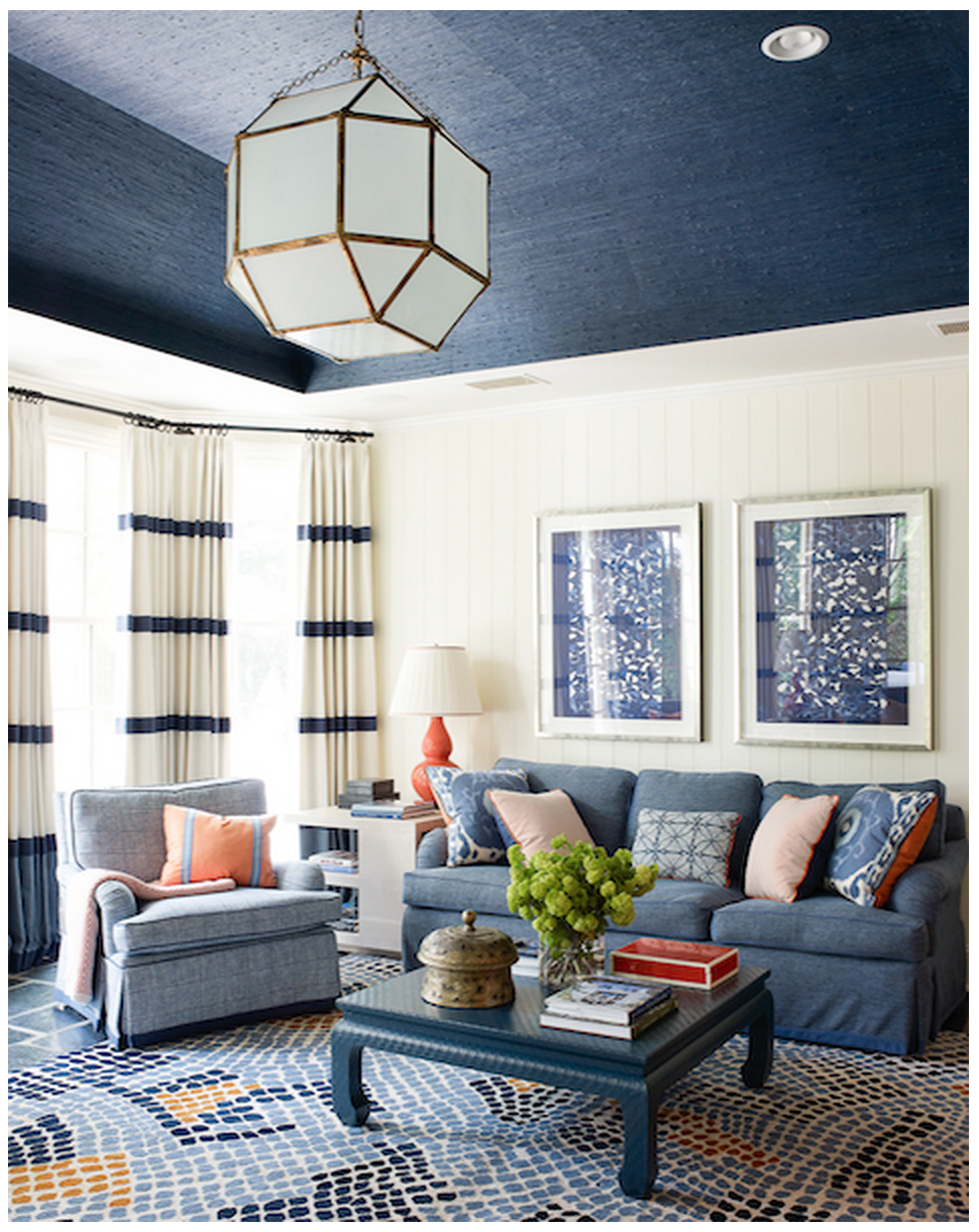
Credit: Design by Lindsey Coral Harper; Image via HouseBeautiful


Credit: Design by Lindsey Coral Harper; Image via HouseBeautiful

This one came across my Instagram feed yesterday. HouseBeautiful spotlighted Lindsey Coral Harper's grasscloth-enveloped room and I adore the big, angular brass-and-translucent-glass fixture. Everything about this room is lovely—the low Ming-style table, classic gourd lamp, framed textiles—but the lighting takes it to another level. 

4. The Captains of Industry

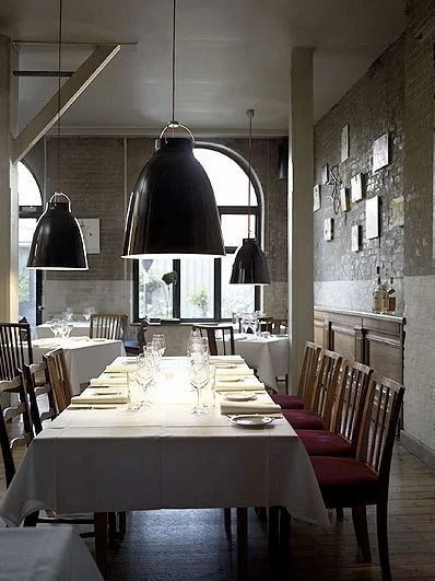
Kitchen island and dining room pendants are often comically undersized. I think many homes, even those without lofted ceilings, could get away with a large pendant hanging overhead, especially one that bathes a small table in a moody pool of light. This shot is clearly taken in a restaurant, not a home, but how lovely would these industrial-style fixtures be in a minimalist farmhouse-type space? Yum. 

5. The Glowing Orb

Source:&nbsp;Flagship Photo

This one's from another restaurant, but it's one of my favorite spots in Boston: Trade. Designed by Maryann Thompson Architects, the place boasts at least two of these huge half-dome fixtures, custom made by a metal fabricator in central Massachusetts. The impact is incredible, and while there's only a single bulb suspended in the center of the dome, the whole thing glows thanks to a saffron-hued interior. They're jaw-droppingly cool in real life.

What do you think? Which room would you be most likely to put a ginormous, glamorous fixture in in your own house?