DIY: Inkblot Wall Art

I’m not what you'd call a “crafty” gal. Sure, I can sew pillows (passably), add a bit of trim to a table cover (with imperfections), and I do own a glue gun. But painting, scrapbooking, pottery, even papier-mache... not in my repertoire.

One thing I’m never afraid to try, however, is DIY wall art—mostly because store-bought wall art is painfully expensive, and I’m not the type to stare at blank walls while I save up for a legit painting by a legit artist. I have DIYed some trendy brushstroke art to fill out a gallery wall in my family room...

IMG_8631.JPG

I recruited my daughter to DIY some abstracts for my parlor…

IMG_8600.JPG

...and I framed some of her abstract watercolors to hang above my bedside desk.

IMG_8578.JPG

This past weekend, though, I decided to go big. We have this wall of framed family photos in our hallway, see, and while I love each of the pics individually, to my eye the full gallery was just missing some oomph. But what could I put in its place?

Meh.  

Meh.  

The answer came to me last week. While browsing Etsy for a set of vintage prints that might work, I came across this trio of inkblots:

Source: KYLOprints on Etsy

Source: KYLOprints on Etsy

Bingo. Mark my words when I say inkblots could be the next brushstroke art. There’s just something so funky, handmade, and appealing about them. And they’re so easy to DIY.

I got to work. After the kids went to bed on Thursday, I assembled my supplies: One bottle of Crayola black tempera paint and one stack of thick paint-and-marker paper. I folded the paper in half, gave it a random spattering of paint, folded and pressed the paper together, and voila: a piece of one-of-a-kind art.

Dave was skeptical of the whole endeavor, but even he had to get in on the action once he saw how much fun I was having.

DIY inkblots

The first few came out pretty sloppy due to an excess of paint; it all sort of blobbed together and the first three inkblots looked basically the same. Once I transferred the tempera to a finer-tipped squeeze bottle and learned to spatter just a small drizzle of paint on just one side of the creased paper, we were in business.

Once I had nine inkblots I was happy with, I arranged them all in a balanced grid and left them on the dining table to dry overnight. 

Inkblot art

In the morning I popped them into the frames. Here’s the finished look. We’re calling the one in the middle Gene Simmons, because duh.

IMG_8601.JPG

I’m loving the look. Of course, now I need to find a new home for the family photos, as I fear my decor habits might eventually traumatize my kids. (“Doc, when I was five, my mom took down my picture and replaced it with a RORSCHACH TEST. Isn’t that messed up?”) Psychological references aside, however, what do you think?

DIY: Removable Bathroom Wallpaper

If you saw last week's backsplash post or my desk makeover post before that, you know I'm all about quick, noncommittal decor projects these days. (A whole-house, whole-yard renovation will do that to you. I want things I can finish in two days, max.)

Smug from my recent successes, then, this past week I decided it was time to finally tackle the walls of my kids' bath. I wanted to cover one wall with a pattern that was youthful and fun, but not so childish that they'd grow out of it in 3 years.

Enter Spoonflower. I love this site's vast collection of graphic patterns, all of which can be printed to order on your choice of fabrics or wallpaper, including two types of removable wallpaper. The number of patterns available is staggering. Plus, it's a marketplace for indie designers, so they get a cut of every order. Points for good design karma!

I opted for a pattern called Birch Grove in Summer, by Willow Lane Textiles:

Source: Spoonflower

Source: Spoonflower

Why the birches, you ask? Tree-themed prints have been trending for a while (see: the ever-popular Woods wallpaper by Cole & Sons, originally designed in 1959 but a current darling of designers, or Birds & Butterflies by Schumacher). But I wanted something unique, and the Spoonflower print felt fresh to me. I also suspected it would pair well with the Spring Meadow paint by Benjamin Moore we put on the walls. 

Here we go... The walls before. 

Here we go... The walls before. 

I needed five of the woven peel-and-stick rolls, in custom lengths to fit my 9-foot wall height. Once they arrived, I assembled my supplies: A sharp utility knife, the squeegee that came with the wallpaper, a microfiber cloth to clean the wall. I also ended up using a level, scissors, and a ruler that could double as a cutting guide. As you can see from the above photo, Dave removed all of the towel rings and bars before we started.

My arsenal. 

My arsenal. 

The first step was to unwrap and re-roll the paper so the top was on the outside. Easy enough.

Unrolling. 

Unrolling. 

Then came our first hurdle. The directions instructed us to start hanging the paper from left to right. But the left side of the wall was mostly window. And our ceilings? Not so straight. Eek.

Window troubles. 

Window troubles. 

After much thought and an awkward 10 minutes of standing on the toilet and snickering about "passing me a roll," we eventually decided to break from instructions and go a little rogue. First, we checked to see that the left wall was vertically plumb (it was). Then we pre-trimmed the paper to remove the window section, making the sheet much easier to handle as we positioned it.

After the window cutout. 

After the window cutout. 

Taking off some weight helped us maneuver it more easily and let us see where the pattern was headed. We were pretty conservative with the cut, though, as we planned to trim it more accurately once the edges of the sheet were up.

Then we removed the backing and tacked the top of the wallpaper sheet to the wall, making sure the paper was horizontally level and leaving about an inch of excess at the top. This ensured that even if the walls and ceiling were crooked, our trees would be perfectly upright.

image.jpg

Once the paper is in tacked in place, you just remove the backing a bit at a time and smooth it all out with the included squeegee. Then you repeat the whole process with the next sheet, overlapping the sheets slightly to get the pattern lined up. We trimmed around the window and vanity as we went, then did all the top and bottom trimming as a final step.

image.jpg

There was definitely some lifting and re-setting of the paper required to get the pattern match just so, so I was thankful I had selected the peel-and-stick paper rather than the water-activated variety, which isn't as repositionable. I won't lie; that part was a bit tedious. But the OCD paid off: You can barely see the seams between sheets!

image.jpg

Here it is all done:

image.jpg
image.jpg
image.jpg

All told, I think we spent about 3.5 to 4 hours on this, including setup and cleanup. I think it would go a lot faster if we did it again. Now that I know how easy the process is (and that I'm actually capable of doing it), I'm tempted to add a fun wallpaper to my son's room, too.  

I'll keep you posted on how it wears over time, but for now, things are looking good. Thoughts? Would you try it? 

DIY: Peel-and-Stick Backsplash

Well, I did it: I bit the bullet and tiled my lovely new, top-o'-the-line kitchen with stick-on subway tiles.

Before you have a chance to type "WTF" in the comments section, let me recap the thought process leading up to this ill-advised move. I've spent the last few months living in the state of Indecision, USA regarding our kitchen walls—the full story is here—and even though I've come around to wall tile, I can't commit to another pricey project, as all our funds are being pumped into the back patio and deck right now. But once I made up my mind to tile, I couldn't bear looking at the bare walls any longer. Every time I walked into the kitchen, they yelled at me: "We're naked! The only thing you'll let us wear is spaghetti sauce! Don't make us suffer through tomorrow's Chicken Tikka Masala!" And I wanted to really KNOW, not just imagine, what tile will make the space look like. 

Spoiler: It looks good. Really good.

Last Monday, I bought 6 packs of STICKTiles online and warned Dave. “Do you know what this weekend is?” I announced. “It’s PEEL AND STICK SUNDAY!”

Cue the side-eye. After killing our budget on a fancy range hood, commercial stove, and marble counters, I was going to put STICKERS all over the wall? Stickers that would likely peel off the paint job we had just paid for a few months ago?

Knowing I was not going to back down, and knowing the at the four-figure cost of real tile was the alternative, Dave took a step back. “Knock yourself out,” he sighed. If it looks great, we agreed, we’d leave it up until we’re ready for real tile. If it looked like ass, we’d just peel it off, sand and repaint, and cut our losses at a couple hundred bucks.

Walls before backsplash
Bare walls before.

Bare walls before.

I got to work clearing the counters, cleaned the walls of dust and grime, and gathered my supplies: A sheet of cardboard to use as a cutting surface, a sharp utility knife, a large, clear ruler, a pencil and some painter’s tape. I unscrewed and removed all of the outlet plates as well. 

My arsenal.

My arsenal.

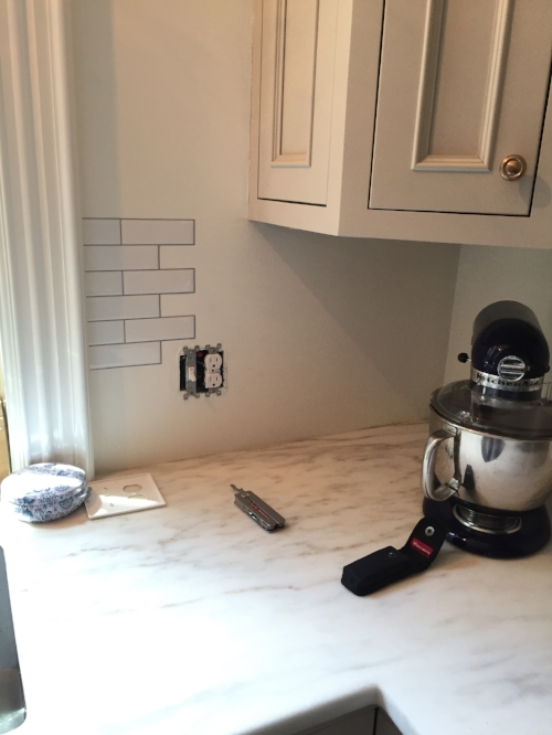
Starting at the window casing nearest the sink, I penciled a faint guideline along the top edge to ensure the tiles would be level and placed the first piece on the wall. 

Faux tiles going up.

Faux tiles going up.

I worked my way toward the corner, overlapping the sheets of tile.

Applying the removable tile

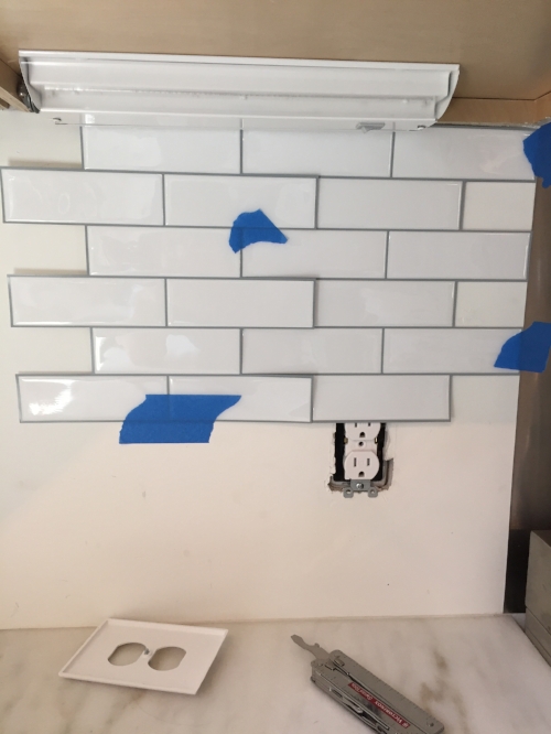
Because it’s an offset subway pattern, there were naturally lots of gaps in the field at corners and along the bottom. Whenever I cut an extra tile or a piece off a sheet for a corner or outlet, I set the excess aside to use later when filling in gaps.

Glad I saved this little guy!

Glad I saved this little guy!

After the first few tiles were up, I started to worry about a slight lean to the “grout” lines, and the pattern becoming off level by the time I reached the stove. I began tacking subsequent sheets into place temporarily with bits of tape before I actually stuck them to the wall, ensuring the pattern would land in the right place once everything had been adhered.

Aligning the peel-and-stick tiles

I continued the process on the right side of the stove. As each length of wall was finished, things looked better and better. 

Tile backsplash in place

And that’s it! I have to say, aside from the slightly rubbery texture when you press hard on them, the fact that they lay flat instead of protruding at the wall, and the tiniest, nearly invisible lines where the tiles overlap, these things look extremely real. They finish the space and the shine adds some dimension. We’ll see how they hold up, especially since I disregarded the explicit instructions not to place tiles this close to the burners of my stove (#safety #meltingPVC #imminentdeath).  

Yup, that was Sunday dinner. "Mommy's busy, kids! Go play!"

Yup, that was Sunday dinner. "Mommy's busy, kids! Go play!"

Backsplask complete

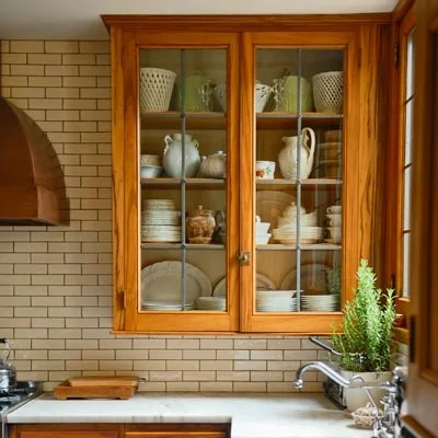
For now, I'm happy. Next year, when we put in the real stuff. I might go larger format, like this:

Or square:

Source: Front + Main

Source: Front + Main

I also I might extend tile to cover the whole sink wall, even around the door and window, like so:

Credit: Design by SuzAnn Kletzien, Image via HouseBeautiful

Credit: Design by SuzAnn Kletzien, Image via HouseBeautiful

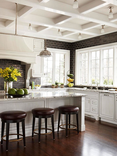
But that’s another idea I need to sell my husband on. Since I know he reads this blog, I’ll just leave these pics of gorgeous all-tiled kitchens right here. They’re SO GOOD.

Source: Better Homes and Gardens

Source: Better Homes and Gardens

What about everyone else? Have you ever tried temporary tiles? Would you?

DIY: An $80 Desk Makeover

For almost as long as we've lived in our house, I've been on the hunt for just the right bedside table. We have a fairly spacious master bedroom by city standards, with room on my side of the bed for more than your average nightstand. A bedside writing desk seemed like a particularly good solution for this space, since I work at home from time to time but don't want to dedicate a whole room to the occasional work-at-home day. 

The problem is, the desk I had, a simple white painted-metal and glass model, wasn’t exactly master-bedroom ready. It was fine in our old office upstairs (now our daughter's room), but it just won't cut it in the master.

Ick. 

Ick. 

Finally I stumbled on a potentially perfect solution: the skirted desk.

Source: Lonny

Source: Lonny

Not only do skirted tables look pretty and polished as a console or desk, but they enable you to stash a ton of stuff underneath. I love secret storage, and love it even more when it looks like this:

Credit: Nam Dang Mitchell via Rough Luxe Perspective

Credit: Nam Dang Mitchell via Rough Luxe Perspective

Credit: Palmer Weiss via La Dolce Vita

Credit: Palmer Weiss via La Dolce Vita

Credit: Tobi Fairley

Credit: Tobi Fairley

Credit: Urban Grace Interiors via Bungalow Blue Interiors

Credit: Urban Grace Interiors via Bungalow Blue Interiors

All of that inspiration aside, however, I did realize that buying yards of fabric and teaching myself to essentially slipcover my desk—box pleats? Yeah, right—was just not in my weekend agenda. So began looking for shortcuts….

Which I found in a 48-inch party table cover that cost just $54. 

Source: Amazon

Source: Amazon

I wasn't done yet, though. While that table cover was just the right size to cover the surface of the Lumisource Pia desk I’d bought at Wayfair.com a few years back, it would be a bit too short to graze the floor. So, to get a little extra length and add a decorative flourish, I turned to decorative trimming. NYC’s M&J Trim has a great selection, and I ordered this 33mm Greek key jacquard ribbon in Pale Blue/Antique for $8 a yard. I needed at least 8 feet to cover the front and sides of the table cover, so I got 3 yards for $24.

he next step was to cut and sew, which I’ll admit I did a little ham-handedly. I simply folded down the ends of the ribbon for a finished edge, then attached it to the skirt via a single stitch along the top edge.

Ribbon trim
Attaching the ribbon
Ribbon trim table skirt edge

Here’s the finished look.

image.jpg

It’s not perfect. I probably had the tension setting too high when I attached the ribbon, hence the slight puckering you see along the edge. And since the table doesn’t have a center kick pleat, your legs don’t really sit fully under the table like they would a regular desk. But I tend to rove around the house when I work from home, so for the 4-6 hours of my work week that I sit here, it’s not bad. And considering I’ve packed it underneath with magazines and sewing supplies, my legs wouldn’t have any place to go anyhow. All in all, it works. Storage, a work surface, and a clean look? Check, check, and check.

image.jpg

If you can't sew a stitch, you can't find a premade party cover in the right size, or you're simply strapped for time, another way to get this look is to order a fab custom skirt from Society Social. I love the colors and the preppy solid tape trim. Cute, no?

Source: Society Social

What do you think? Would you attempt this project in a weekend?

The Tile Files (a.k.a. Backtracking on the Backsplash)

It's been quiet here aboard the S.S. Blog, for a couple of good reasons. First, I've been dealing with some truly pressing life matters, which you can catch up on here. Second, I've been working on a super-secret project that I'm not allowed to tell you about yet. It's good—really good—and I'll share more soon. I promise!

In the meantime, though, how about a little stroll on the inside of my crazy head? Eh? Sound like fun? Off we go.

For the last several months, every time I've walked into our renovated kitchen I've alternated between patting myself on the back and kicking myself in the rear about one component of the kitchen design: the backsplash, or the lack thereof. 

We skipped putting in a backsplash, see, because I've grown sick to death of seeing kitchens clad in white rectangular tile, a.k.a. subway tile. Everyone says it's "timeless" and "classic," but people also thought Sophia and Olivia and George were fresh baby names about 5 years ago. Anti-trends become trends. And while I'm certainly not claiming to be immune to decor trends (hello, herringbone tile all over mah house, and subway tile in my kids' bathroom), I hated to jump right on the subway train for my long-awaited kitchen without at least considering other options. 

"You'll never get sick of this!" -- Everyone on the Internet, 2014-2016

"You'll never get sick of this!" -- Everyone on the Internet, 2014-2016

Problem was, I couldn't find another option that made sense or excited me. Tiny mosaic tile? Just what I needed—more grout to clean. Spanish or Moroccan-style painted or encaustic tiles? Too busy for the space. Rustic travertine? Too porous. Stainless steel tile? Ew.

Hubby and I had already chosen to put a steel panel behind our commercial-style range, and we're clean-as-you-go cooks, so really: Did we need to cover the rest of the kitchen in ceramic or stone? We started to doubt it.

The backsplash-free countertops. Is this sacrilege?

The backsplash-free countertops. Is this sacrilege?

Now the kitchen's finished, sans backsplash. Some days I love the look. Seeing the plaster walls instead of ceramic tile makes the kitchen feel kind of homey and warm, not cold and washroom-y. Other days I look at the walls above the counters and they look so naked. Should I have gone subway after all?

In the last few days, I've been tinkering with the idea of applying subway tiles of the peel-and-stick variety, like Smart Tiles or StickTiles, pictured below. At $25 for four sheets, the StickTiles are not a huge commitment, and they could let me "try on" the look before committing to an expensive tiling project. 

Source: StickTiles

Source: StickTiles

But then, a few days ago, I saw this gorgeous pic on queen-of-style Aerin Lauder's Instagram feed...

Credit: @aerin

Credit: @aerin

... and I thought, holy CRAP. Square tile! Is it back? Is this The Thing I Need?
Yes, square tile. Just when I thought we couldn't go more public-restroom chic than rectangular subway tile, in marches the square variety, just waiting to cover our bathrooms, kitchens, and mudrooms in industrial-cool goodness. The tile in Lauder's pic, above, takes square in a luxe direction via a rich, translucent taupe glaze; I'm not sure where it's from, but it no doubt costs $$$. The extra-wide grout gives the shape even more oomph.

It led me on a search for more square tile inspiration, and now I'm realizing how cool the plainer square stuff can be, too. I mean, look at these pics. 

Source: Door Sixteen

Source: Door Sixteen

Source: DecorPad

Source: DecorPad

Source: House & Home

Source: House & Home

Is this what I need lining my kitchen walls? Will I just regret following this trend instead of the last? Do you even like the look? Should I stick with the StickTiles? Please discuss.