Watch Now: How to Personalize Any Kitchen—on a Budget

Friends! This week kicked off with a fun announcement—the official launch of the Real Simple Home. Today the magazine debuted a dedicated page full of project details, like the Nate Berkus and Jeremiah Brent-designed living room; the entry by Robin Henry Studio; bedrooms by Studio McGee and Decorist’s Jessica McCarthy; a tween room by Jenny Komenda, a laundry room by Sabrina Soto; an office by Homepolish designer Ariel Okin, and a terrace by RS’s own Stephanie Sisco.

But today they also published this video—a tour of the kitchen and all the little decorative details that didn’t make it into print. Have a look:

Believe it or not, we decided to shoot this at the last minute while I was in town with the Joss & Main team for the installation! And we shot the whole thing in just a couple of takes. See if you can spot the ladder and tools in the background… As I mention in the clip, we really did install this DIY wallpaper by ourselves in under an hour!

After seeing this “after”, do you think you’d tackle peel-and-stick wallpaper in your own kitchen? Anything in here that you’d definitely do/not do?

To read the full article, head over to Real Simple.

Real Simple Home: The Project Reveal!

Back in May, I shared one of the most exciting projects I’d be working on this year—the Real Simple Home. And I’m pleased as punch to FINALLY be sharing an official update… It’s done!!

But let’s back up. After the initial shock of excitement/joy/terror wore off, I spent the rest of May getting to work. The venue was revealed to be 550 Vanderbilt, a gorgeous new residential development in Brooklyn boasting incredible city views and luxe amenities. Our unit was a penthouse, which was partially complete but still waiting on some finishing touches. With kitchen cabinetry, flooring preselected and installed, my job was going to be adding a bit of personality to the space via décor, lighting, and a small amount of furniture, which I’d source from Joss & Main.

Fun and easy, right? Not so fast. My kitchen not only had most pieces already in situ, it was open and adjacent to the living room, which was being designed by Nate Berkus and Jeremiah Brent.

Wait, did you get that?

NATE BERKUS AND JEREMIAH BRENT. And, oh yeah, the other designers in the mix include Sabrina Soto (love her, and loved styling her for a catalog shoot last summer), Studio McGee (my be-all, end-all for clean-boho-rustic design inspiration), Jenny Komenda, Robin Henry, Ariel Okin of Homepolish, and Jessica McCarthy of Decorist.  

Low stakes, right?

So let’s review this again. I needed to:

  • Build on what was already there.

  • Add a healthy dose of personality.

  • Make it functional.

  • Make it photogenic.

  • Shop it all from Joss & Main.

  • And for the love of God, DO NOT DO ANYTHING THAT WILL LOOK BAD NEXT TO THE WORK OF NATE BERKUS.

Uuunnnnggggghhhhhhhhh.

But since hyperventilating wasn’t going to get me anywhere, I decided to start where I always do: with measurements of the space and a room mockup. (Yup, the same tool I talk endlessly about in my book.) I had a couple of photos to work from, including this rendering of another unit from a real estate listing:

Source: 550 Vanderbilt

I kept these on my desktop as I began to shop for items that would bring life to the space, testing them out in my digital rendering of a room.

Here’s where I landed with my mockup.

Real_Simple_Donna_Garlough_room_mockup

Next, I took things a step further and mocked up what my stools and lights might look like at the island. A little birdie also told me that the walls were being painted a warm cream tone in Nate & Jeremiah’s space, so I included a swatch to ensure everything would flow.

Real_Simple_Home_kitchen_plan.jpg

By July, it was time to install. My team from Joss & Main and I headed to Brooklyn to unpack the goods, and we put up this awesome peel-and-stick wallpaper to give things a graphic, youthful spin.

Source: Joss & Main

Source: Joss & Main

That’s right, I said peel-and-stick. It’s removable, yo! Installing it was easy as pie, and took just about an hour to do a two-strip section of wall adjacent to the kitchen’s wine fridge.

Next, we tested out lots of different runners and decor to see how they might work together in the space.

Real_Simple_Home_Joss_and_Main

Meanwhile, the team at the organizing company Neat Method outfitted all the cabinets with great storage solutions.  It IS Real Simple, after all.

Image credit: Christopher Testani

Image credit: Christopher Testani

Image credit: Christopher Testani

Image credit: Christopher Testani

The end result, which we’ll be celebrating at a launch party next week, is below. Not too shabby, right?

Image credit: Christopher Testani

Image credit: Christopher Testani

Image credit: Christopher Testani

Image credit: Christopher Testani

Of course, mine was only one of the spaces in the Real Simple Home—and you must, must MUST check out the others in the October issue of the magazine, on stands September 21!

If you’re in the NYC area, you can actually tour the space in person starting next week. Stay tuned to @real_simple on Instagram for updates and hours!

And if you’re looking to shop the products above, you can find them all (plus a few other complementary picks) right here.

What’s your favorite part of the space? Or do you hate it entirely? I’d love to hear your comments below.

xx

Me + ​Real Simple = OMG

Real_Simple_July_2018_cover

I’m mayyyyyybe going out on a limb here, but if you’re reading this blog, I’m guessing you’ve heard of the magazine Real Simple. I remember when it launched in 2000—I was a magazine intern at the time, and I thought, “Holy crap. A magazine that’s all about how to make things easier, not just fancier/better/prettier/[insert comparative adjective here]. Why has nobody done this before?”

Real Simple pretty much invented the home hack. I’ve been a reader from the beginning, even contributing a tip or two to the magazine now and then. My 2016 makeover of a Bachelor couple's space was featured on their website, too. 

So it’s extra-exciting to share some news this month: I’ve been tapped to style the kitchen of the Real Simple Idea Home, a project that’s going to be revealed in full in their October issue! A teaser appears in the July edition:

What's the Real Simple Idea Home? In short, it’s a real-life residence that’s going to be full of “aha” moments, from smart decorating ideas to budget-stretching solutions. Each space is being furnished and decorated by a different brand or designer. Being Real Simple, there’ll naturally be tons of storage tips as well, courtesy of the organizing team at Neat Method. There is an INCREDIBLE roster of design talent on board for the project, which I won’t share yet... Just know that I’m floored to be in the mix!

Right now I’m still tinkering with the design. Given my job at Joss & Main, I’ll be filling the space with lots of budget-friendly kitchen items and decorative touches from the website.

You’ll have to wait until late September for the full reveal, but for now, click here to read a teaser from the issue now on stands: "5 Pro-Approved Ways to Make a Small Kitchen Look Bigger."  The kitchen pictured in the article is my own, photographed by Joyelle West for my book (link to purchase here). And pick up a hard copy before it’s gone! 

5 Renovation "Rules" I Broke... And Never Regretted

Earlier this week, Architectural Digest’s new sister site, Clever, ran a couple of my comments in a story about budgeting for a kitchen renovation. It got me thinking back to my own kitchen reno, which at this point is about three years old (and already starting to need a few touch-ups… thanks, kids) and some of the out-of-the-box decisions we made.

A screenshot from my book trailer, showing me in our never-this-quiet kitchen.

A screenshot from my book trailer, showing me in our never-this-quiet kitchen.

For the most part, our renovation was pretty “safe”—we didn’t take any crazy-big style swings, except in the attached powder room, and our only gratuitous, totally unnecessary splurge was spending too much on our custom range hood, a choice I’ll never regret. The putty color of our cabinetry was a departure from ubiquitous white or gray—it’s especially interesting when you see how it changes in different light—but it’s still pretty safe. We also selected traditional silhouettes and details for the cabinet doors, hardware, and lighting that would complement the 1860s architecture of our home rather than going eclectically modern. If we put the home on the market today, the style probably wouldn’t scare any open-house-goers away.  

But there are a few other moves we made that a lot of people might not have. Specifically:

1. Living at home—with kids—during the renovation.

I’ve posted about this before, but giving up your kitchen when you have toddlers is no joke. You can read about how we dealt with it here, but I’m not going to lie and say it was easy. Was it a good idea? You bet. Because if there’s anything worse than not having your kitchen with todders, it’s doing the same thing when you have relentlessly demanding school-age kids who insist on having MADE-TO-ORDER OMELETS ON A TUESDAY MORNING. They barely remember the process now.

2. Not opening up the floor plan.

It’s practically a required part of the script on HGTV these days: “We’re going to take down this waaaalllll, create some great flooowwww, just really connect this space with that one and create this amazing space for entertainingggggg….” Barf. Not once did we consider blowing out all the walls in our house to connect our kitchen, dining, and sitting rooms. Why? Because one of these days, there’s going to be a backlash against the Open Concept Avalanche of the Mid-to-Late Twenty-Teens, and frankly, I like it when old houses have a lot of small rooms. In my house, we make a mess when we cook, and I don’t want to look at that mess when we sit down with friends.

I also find that moving between rooms affects my mood in a good way. It’s casual bustle—think: simultaneous cooking, cleaning, snacking, catching up on plans—whenever we’re in the kitchen, but the dining table is generally where my family goes to focus on something, whether that’s a meal or a craft project. When we move to the front parlor, we’re usually relaxing, talking, watching funny clips on YouTube, or building a tower with Magna-Tiles. The downstairs family room is for sofa forts and movies. For me, making a home that works for modern life is about more than just knocking down walls.

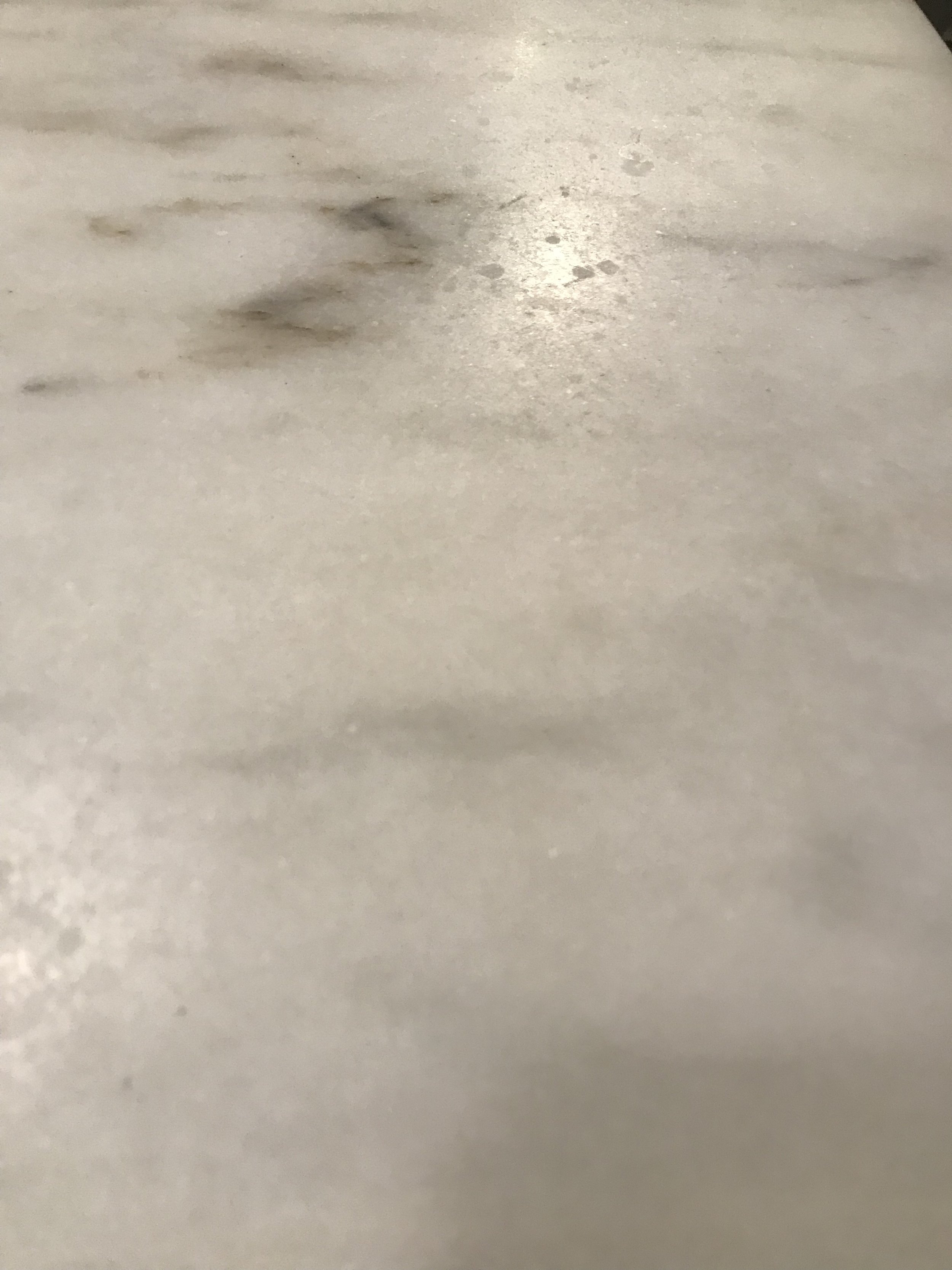
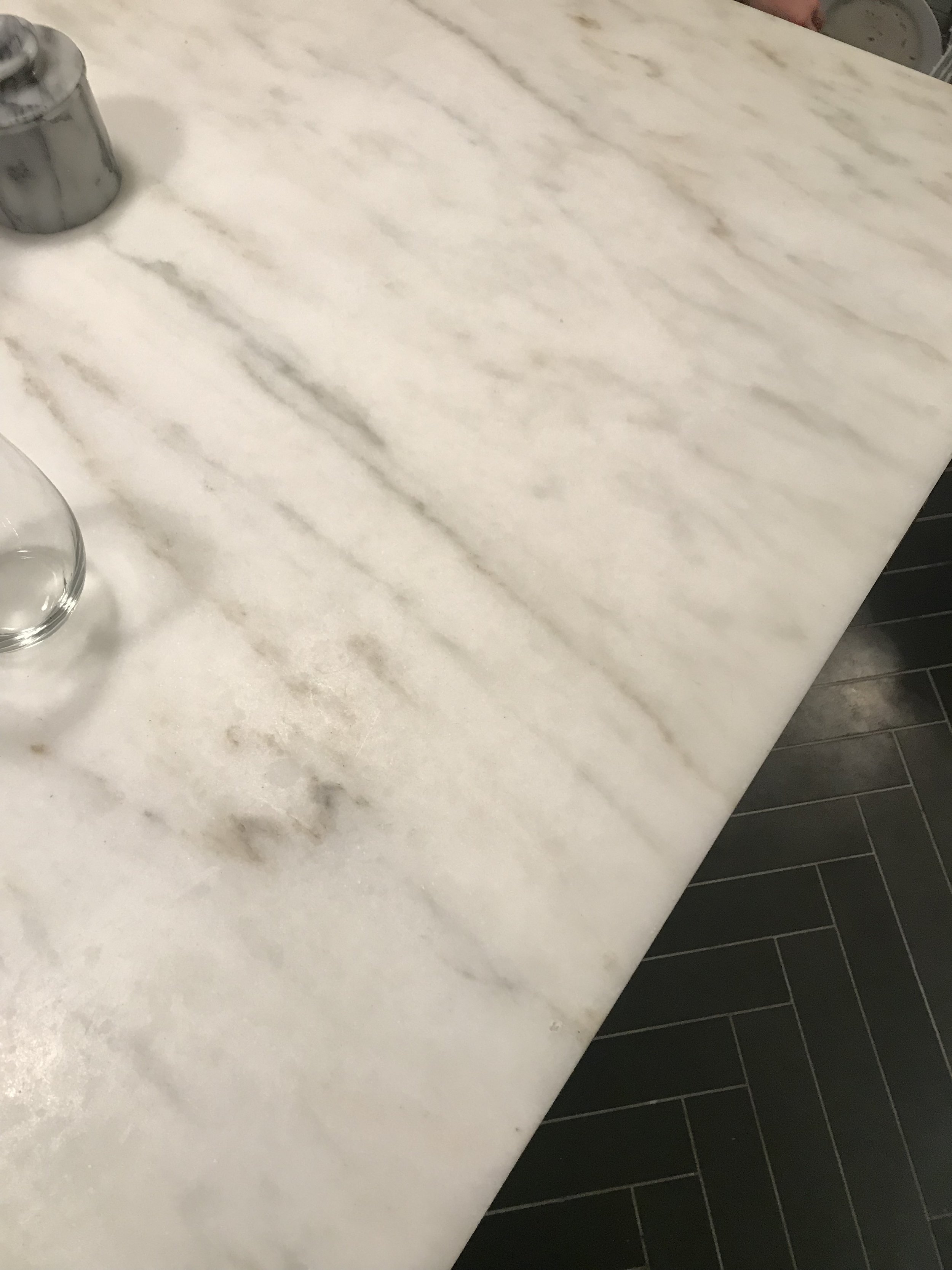
3. Choosing countertops that will chip, scratch, and stain.

Got your attention with that headline, didn’t I? But really, deciding whether or not to put in marble countertops is is a tough call for many people, and it’s the subject of one of my most popular posts. The bottom line is, we wanted a kitchen that would develop patina and character over time. If the idea of countertops that’ll show wear and tear bothers you, keep on walking. But if you basically want to live inside a vintage French brasserie, buy the marble.

4. Not installing a backsplash (at least not right away).

You read that right. We didn’t do a backsplash. We were on a deadline, couldn’t decide what we wanted, and ended up leaving the walls bare. Eventually I put up some stick-on tiles to test out the look of a tiled wall (spoiler: it looked good enough to photograph for my book), but we STILL have to install the permanent tile that will cover the space between the counters, cabinets, and run across the whole back wall. But people still like our kitchen. We're all still alive. Everything is fine. 

5. Installing a really loud fan.

Since we didn’t previously have a powder room on our home’s first floor, we added the world’s tiniest loo just off our kitchen. The problem with putting a toilet within six feet of your kitchen island, however, is that sound travels, if you get my drift. So instead of taking our contractor’s recommendation and installing one of the new ultraquiet vent fans in the powder room, we purchased the noisiest fan we could find. “We actually want all the sones,” we told our somewhat befuddled electrician. And you know what? While the resulting auditory experience is a bit like peeing in the lavatory of a 747, everyone appreciates the LA LA LA I CAN’T HEAR YOU element of forced privacy we managed to create. It works.

What about you? Are there any “do’s” in kitchen renovations that you think are a “don’t”? Any other unconventional decisions you’ve made (or want to make)? Share in the comments below!

Honed Marble Countertops: Three Years Later

As a blogger-on-the-side, I’m constantly telling myself I’ll post more updates. And I’ve even had fun things to announce! A feature in Apartment Therapy! Another one! A mention on Architectural Digest's new site, Clever, and an interview by the Associated Press that got picked up by the New York Times! OMG.

But if I’m being real, what actually inspires me to post here is real-life design questions and challenges. And a couple of weeks ago, a guy named Bill who found me via this blog reached out to ask about my countertops. You know, the ones I posted about in 2015 and said I’d update everyone on later.

Well, Bill was curious how those honed marble countertops of mine were holding up. He was thinking of putting in honed marble in his own kitchen, and wanted to know how they actually weathered the storms of my kitchen, kids, and life. Did I still like them? Knowing what I know now, would I use the same material, or would I go with something more “durable” and less costly, like quartz?

Here’s what I told Bill. And here are some crappy pictures I took to show him exactly what I meant.

Hi Bill! I still absolutely love the marble. It has taken on some visible wear, so if you’re partial to a really immaculate look, you might not be thrilled, but personally I love the character. It’s a very European/bistro look. 

I’m trying to get a good shot of what the etching looks like right this second but you can only see it under certain light and certain angles.

FullSizeRender.jpg
IMAGE.JPG
IMAGE.JPG

Keep in mind I make zero effort to keep lemon juice/vinegar off the counters. I just deal. 

Also worth noting is the opaque marks that could appear around the sink edges if, say, your six year old throws a fish tank into the prep sink (yup).... it’s because it’s a softer stone, but again, these don’t bother me. I’d do it again!  

IMAGE.JPG
IMAGE.JPG

So there you have it. Anyone out there have honed marble countertops and NOT feel the same way I do? If your experience has been different, what did you not like about their aesthetics and durability over time? Share with me in the comments below!

xx Donna