I’m mayyyyyybe going out on a limb here, but if you’re reading this blog, I’m guessing you’ve heard of the magazine Real Simple. I remember when it launched in 2000—I was a magazine intern at the time, and I thought, “Holy crap. A magazine that’s all about how to make things easier, not just fancier/better/prettier/[insert comparative adjective here]. Why has nobody done this before?”
Real Simple pretty much invented the home hack. I’ve been a reader from the beginning, even contributing a tip or two to the magazine now and then. My 2016 makeover of a Bachelor couple's space was featured on their website, too.
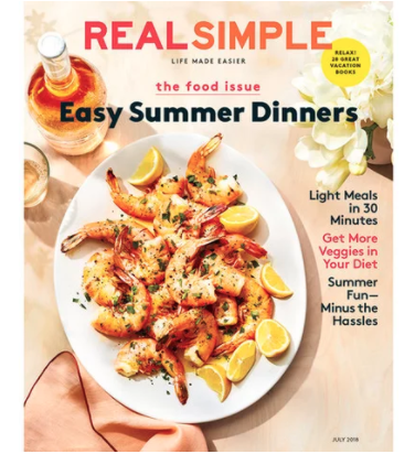
So it’s extra-exciting to share some news this month: I’ve been tapped to style the kitchen of the Real Simple Idea Home, a project that’s going to be revealed in full in their October issue! A teaser appears in the July edition:
What's the Real Simple Idea Home? In short, it’s a real-life residence that’s going to be full of “aha” moments, from smart decorating ideas to budget-stretching solutions. Each space is being furnished and decorated by a different brand or designer. Being Real Simple, there’ll naturally be tons of storage tips as well, courtesy of the organizing team at Neat Method. There is an INCREDIBLE roster of design talent on board for the project, which I won’t share yet... Just know that I’m floored to be in the mix!
Right now I’m still tinkering with the design. Given my job at Joss & Main, I’ll be filling the space with lots of budget-friendly kitchen items and decorative touches from the website.
You’ll have to wait until late September for the full reveal, but for now, click here to read a teaser from the issue now on stands: "5 Pro-Approved Ways to Make a Small Kitchen Look Bigger." The kitchen pictured in the article is my own, photographed by Joyelle West for my book (link to purchase here). And pick up a hard copy before it’s gone!


