Honed Marble Countertops: Three Years Later

As a blogger-on-the-side, I’m constantly telling myself I’ll post more updates. And I’ve even had fun things to announce! A feature in Apartment Therapy! Another one! A mention on Architectural Digest's new site, Clever, and an interview by the Associated Press that got picked up by the New York Times! OMG.

But if I’m being real, what actually inspires me to post here is real-life design questions and challenges. And a couple of weeks ago, a guy named Bill who found me via this blog reached out to ask about my countertops. You know, the ones I posted about in 2015 and said I’d update everyone on later.

Well, Bill was curious how those honed marble countertops of mine were holding up. He was thinking of putting in honed marble in his own kitchen, and wanted to know how they actually weathered the storms of my kitchen, kids, and life. Did I still like them? Knowing what I know now, would I use the same material, or would I go with something more “durable” and less costly, like quartz?

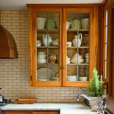
Here’s what I told Bill. And here are some crappy pictures I took to show him exactly what I meant.

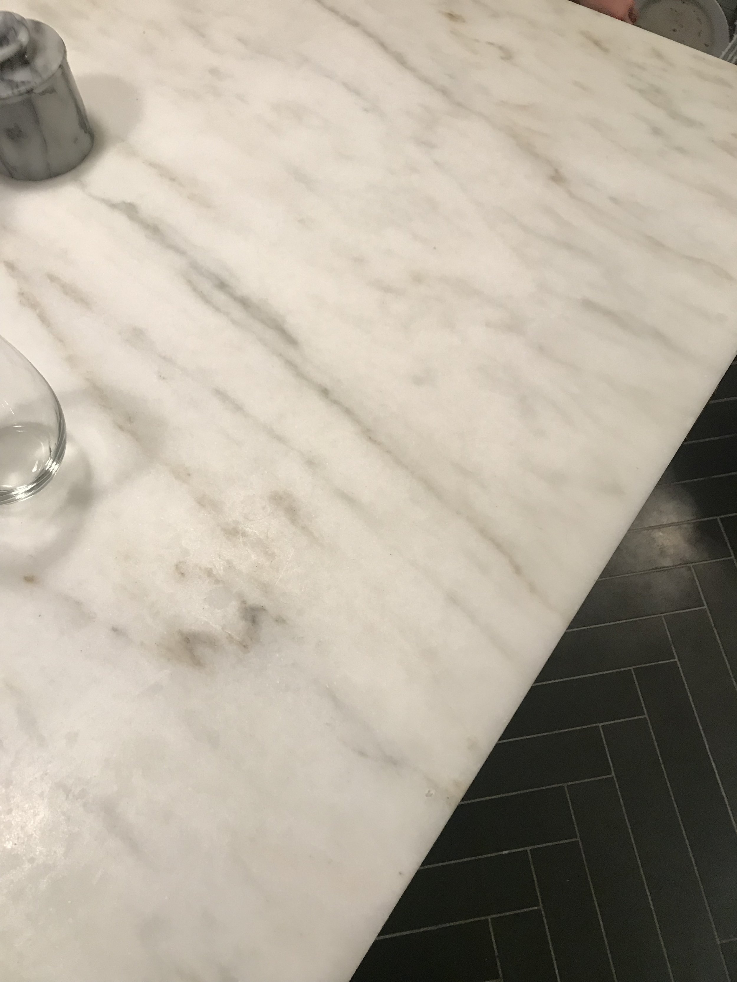
Hi Bill! I still absolutely love the marble. It has taken on some visible wear, so if you’re partial to a really immaculate look, you might not be thrilled, but personally I love the character. It’s a very European/bistro look. 

I’m trying to get a good shot of what the etching looks like right this second but you can only see it under certain light and certain angles.

FullSizeRender.jpg
IMAGE.JPG
IMAGE.JPG

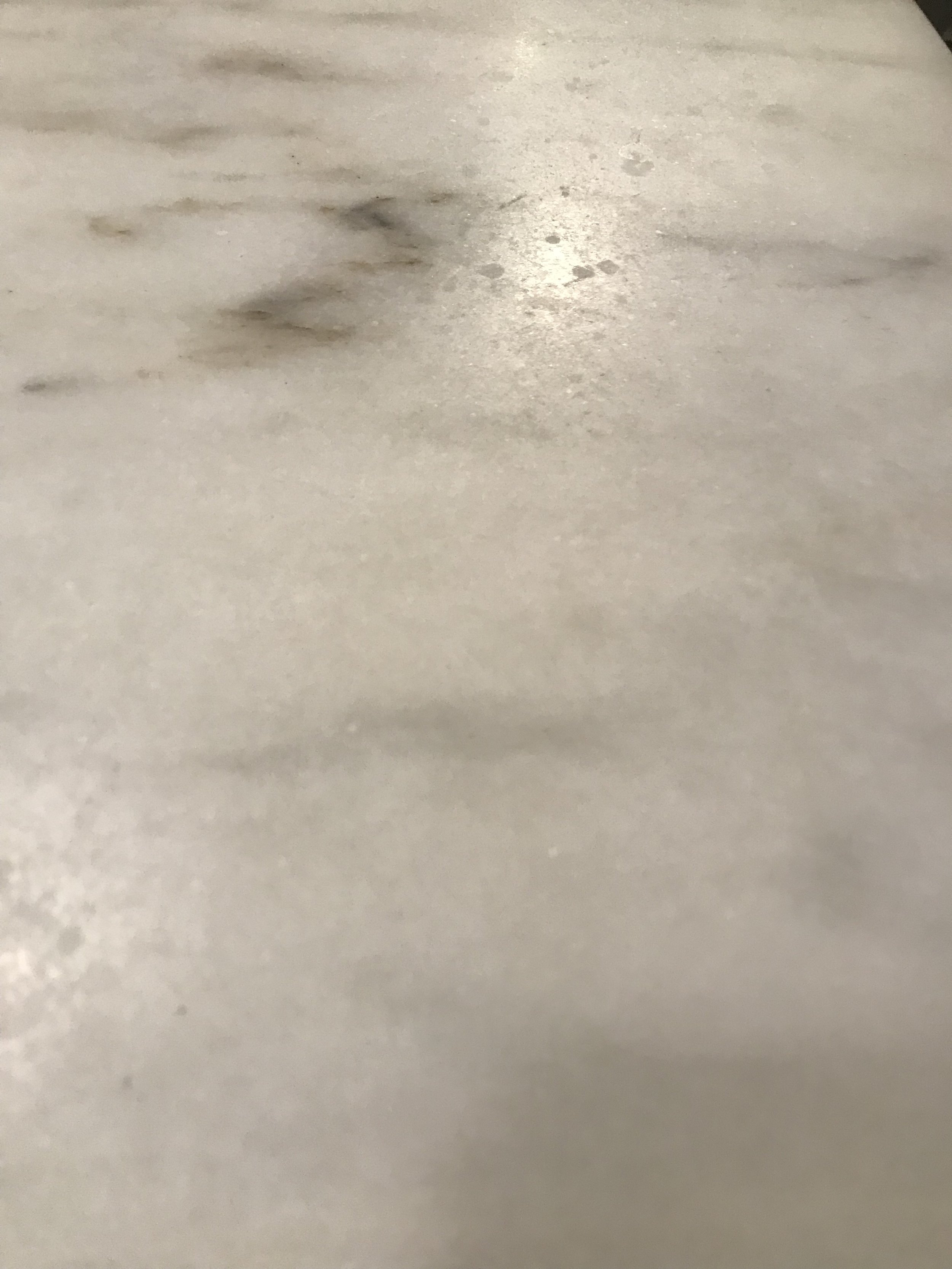
Keep in mind I make zero effort to keep lemon juice/vinegar off the counters. I just deal. 

Also worth noting is the opaque marks that could appear around the sink edges if, say, your six year old throws a fish tank into the prep sink (yup).... it’s because it’s a softer stone, but again, these don’t bother me. I’d do it again!  

IMAGE.JPG
IMAGE.JPG

So there you have it. Anyone out there have honed marble countertops and NOT feel the same way I do? If your experience has been different, what did you not like about their aesthetics and durability over time? Share with me in the comments below!

xx Donna

Mock-Up to Makeover: How Four Celeb Spaces Came to Life

You know that phrase “Jack of all trades, master of none”? Lately that feels like my motto. I’ve been jumping between work, my upcoming book, and of course my family, and it seems like none of it is getting enough attention. The good thing is, everything I’ve been doing has been heaps of fun.

This summer and early fall, my plate was stacked particularly high with makeover projects. I was able to design a great living room and office for the author and personality Katherine Schwarzenegger (yes, Arnold and Maria’s daughter), a backyard space for Pretty Little Liars star Shay Mitchell, and a bedroom and nursery for entrepreneur and TV star Whitney Port.

One challenging aspect of these projects is working with the homeowner from a distance and not being able to see the spaces in real life before I select the products. Fortunately, technology is there to help bridge the gaps: I get measurements of the space and often create 3D rendering of the rooms using software such as RoomSketcher, which is a stripped-down version of the advanced CAD software a lot of interior designers use. We also communicate via phone and email—so, so many emails!

But the biggest aid is my beloved room mock-ups, a concept I dedicate a lot of space to in my book, Your Home, Your Style. The benefits of a digital mock-up are twofold:

1. They help me visualize how products will look together in real life and see whether the space looks balanced.

2. They let my collaborators in on the design plan so they can flag anything that doesn't work and suggest changes.

Here’s a mock-up of the backyard entertaining setup I put together last year for Julianne Hough:

Julianne_Hough_outdoor_mockup

Here it is in final photos:

Photo credit: Justin Coit for Joss & Main

Photo credit: Justin Coit for Joss & Main

Photo credit: Justin Coit for Joss & Main

Photo credit: Justin Coit for Joss & Main

Photo credit: Justin Coit for Joss & Main

Photo credit: Justin Coit for Joss & Main

Here’s the mock-up of Katherine Schwarzenegger's living room:

Katherine_Schwarzenegger_living_room_design

And here’s the space finished:

Photo credit: Lu Tapp for Joss & Main

Photo credit: Lu Tapp for Joss & Main

Photo credit: Lu Tapp for Joss & Main

Photo credit: Lu Tapp for Joss & Main

I worked on actress Shay Mitchell’s outdoor space with my colleague Emily Arnow for AllModern:

Shay_Mitchell_outdoor_mockup

And the pics turned out great:

Photo credit: Lu Tapp for AllModern

Photo credit: Lu Tapp for AllModern

Photo credit: Lu Tapp for AllModern

Photo credit: Lu Tapp for AllModern

Photo credit: Lu Tapp for AllModern

Photo credit: Lu Tapp for AllModern

Whitney Port’s nursery project with Joss & Main was SO MUCH FUN. We tinkered a lot and came up with this:

Whitney_Port_nursery_design

It turned out even better in real life. We added wallpaper at the last minute:

Photo credit: Nicole Gerulat for Joss & Main

Photo credit: Nicole Gerulat for Joss & Main

Photo credit: Nicole Gerulat for Joss & Main

Photo credit: Nicole Gerulat for Joss & Main

Whitney_Port_Nursery_detail

Have you ever created a mockup like this? Do you have any other favorite ways to document and organize your decorating projects?

Moroccan Tile on a Budget

For those of you not following me on Instagram—and if you're not, please do!—this entry is inspired by a pic I recently posted from NYC's Javits Center, where I headed to scope out trends in home decor. Among the aisles of throws, pillows, baskets, lamps, and bowls, I spotted a booth full of what looked like encaustic tile—you know, those Moroccan-style patterned squares everyone on Pinterest seems to be putting in their entries, bathrooms, laundry rooms, and kitchens. 

Moroccan_tile

The booth was overflowing with people, which makes sense given how popular Moroccan encaustic tile has become. Take, for example, this bathroom flooring at my hotel in Nashville recently, the Thompson:

Thompson_Nashville_bathroom_tile

My friend Jamie recently renovated her mud room, and she covered the floor with this black and white pattern:

IMG_1566.JPG
IMG_1565.JPG

A local designer I know, Shannon Tate, recently installed this gorgeous tile in a client's kitchen:

Design by Shannon Tate Interiors, photo by Joyelle West

But not everyone has the budget (or fear of commitment) that a tile install like his requires. Enter the alternatives. The samples I saw at NYNOW were actually vinyl "rugs" you could place over any hard surface to get the look of Moroccan tile on a non-permanent basis. Here are some more pics courtesy of the company, Adama Alma, which is based in Spain. Cool, right? 

Source: Adama Alma

Source: Adama Alma

Source: Adama Alma

Source: Adama Alma

Source: Adama Alma 

Source: Adama Alma 

Apartment Therapy has done a feature on other ways to give your space that punchy, patterned look for less. One of my favorite ideas they featured was stenciling a tile-like pattern on your flat surface, as shown on the stairs below. 

Source: Lonny via Apartment Therapy

What do you think? Are you brave enough to do the tile thing? Would you fake it? Do you even like the look? 

Judging Books by Their Covers

Over the last few months, I've spent much of my time outside of work on my book, now titled Your Home, Your Style, which is inching its way toward publication. (Official release date: April 2018). 

One thing my editor, publisher, and I have spent a lot of time working through is the cover design. Because this is a home decor book, it's extremely important to me that the cover is one that people will eagerly display in their spaces. It's not lost on me that the most successful and beloved design books of the last several years all have a striking visual presence and inevitably become part of their owners' decor. I want the book to sit out on people's coffee tables, consoles, and bookshelves, begging to be picked up and flipped through a few pages at a time.

If course, it wouldn't hurt if the book's design landed it in photos that bloggers and stylists share on Pinterest, such as this vignette showcasing designer/blogger Erin Gates's bestseller Elements of Style. I mean, how can you NOT want to take this whole look home?

Source: Swoon Worthy

Source: Swoon Worthy

Then there's this lovely vignette I spotted on the blog Waiting on Martha, featuring Carolyne Roehm's A Passion for Blue & White. I love the book, the flowers, the collected objects, everything.

I adore how books fit into this space by designer/blogger Paloma Contreras at the New Orleans Showhouse:

Here, designer and blogger Justina Blakeney shows how colorful books, including her own bestseller The New Bohemians, can be objects of layered beauty:

Source: The Jungalow

Source: The Jungalow

What if my cover was so good that it would just pop up in magazines or catalogs as a prop from time to time? OMGIWOULDDIE.

Source: William-Sonoma

Source: William-Sonoma

But creating a book that lots of people will want to display is not as simple as choosing a pretty color or picking a nice photo to put on the front. I also want my book's jacket to reflect the contents, and because the homes I feature inside don't share the same aesthetic, there's no one image that represents everything within. I also want the book to be able to fit into every style of home, from traditional townhouses to breezy beach houses, modern lofts, eclectic bungalows, and more.

It's a tall order, but we're making progress. My uber-talented book designer is Laura Palese, who has designed books for Gwyneth Paltrow, Chrissy Teigen, Laura Prepon, and more. She's a rockstar. We've landed on a tentative cover look, and while I won't be able to share images until September, one element that we're currently planning to incorporate is this embroidered linen pattern I first spotted on a pillow on Joss & Main:

Embroidered_linen_pillow

It wasn't easy finding a print or texture that could cohabitate with traditional, modern, coastal, bohemian, and other decor styles equally well, but I think this one's pretty versatile, don't you?. If you look closely, the fabric has a great linen weave, and I'm hoping we can recreate some of tactile effect with slight embossing. We'll see.  

What do you think? Do you have any coffee table books on display, and what made you choose them? Have you ever purchased a book based on looks alone, and where did you put it? Comment below...

Featured! A Trio of Bedroom Makeovers

Pillows, headboards, nightstands… Lately it seems like all I’ve been looking at is bedrooms. Lucky for me, the spaces—and homeowners—I’ve had the chance to work with in the last two months have been nothing short of dreamy, and the love for the resulting rooms has been pouring in from far and wide.

Bedroom-makeovers-Donna-Garlough

First up: In the weeks before Christmas, I worked on behalf of Joss & Main to design master bedrooms for two incredible women, Olympic gymnasts and friends Shawn Johnson and Nastia Liukin. Nastia was moving into a brand-new home near Boston with her fiance, Matt, and needed a soup-to-nuts design. Shawn, meanwhile needed help adding a layer of personality and coziness the relatively bare-bones space she shared with her husband, Andrew, in Nashville. Both women travel almost nonstop, so they were eager to create welcoming retreats where they could go to relax and recharge.

Funny enough, both Nastia and Shawn selected the same bed, a grand yet rustic sleigh style, so part of the challenge was fine-tuning each bedroom design so it felt distinctly like either Shawn or Nastia. I worked with each of the women to create mockups that we could tinker with together, swapping out products until we were both happy with the look.

Shawn’s mockup took on a slightly more feminine, farmhouse feel, with some linen and ticking stripe and different finishes on the bed and nightstands...

Feminine-farmhouse-bedroom

...and here’s how it turned out.

Images credit Nicole Gerulat for Joss & Main

Images credit Nicole Gerulat for Joss & Main

Nastia’s bedroom mockup went in more of a rustic-glam direction, with a crystal orb chandelier and fur throw...

Rustic-glam-bedroom

...and here’s the finished look.

Images credit Nicole Gerulat for Joss & Main

Images credit Nicole Gerulat for Joss & Main

The following month, I worked on my first makeover on behalf of Wayfair Canada, a sister brand to Joss & Main. Angela Price, a Montreal-based blogger and star of the reality show Hockey Wives, wanted a glamorous new look for her bedroom. This one was a thrill to design, as Angela was really into the idea of going moody and dramatic. When I pointed out that a lot of her inspiration images had dark walls, I suggested painting the walls a near-black shade, Domino by Sherwin-Williams, and she was 100% game. (How amazing is it when someone just gives you their total trust? I was giddy.)  Here’s the mockup we created together…

…And here’s the finished room.

All images credit Marie-Lyne Quirion for Wayfair Canada

All images credit Marie-Lyne Quirion for Wayfair Canada

I’ve been overwhelmed by the great coverage these bedroom makeovers have gotten, including three features on People.com and a nod on the Montreal blog MTL, as well as Shawn, Nastia, and Angela's own blogs.

Do any of these bedrooms speak to your style? If so, which would you choose? Leave a comment below!