It's been quiet here aboard the S.S. Blog, for a couple of good reasons. First, I've been dealing with some truly pressing life matters, which you can catch up on here. Second, I've been working on a super-secret project that I'm not allowed to tell you about yet. It's good—really good—and I'll share more soon. I promise!
In the meantime, though, how about a little stroll on the inside of my crazy head? Eh? Sound like fun? Off we go.
For the last several months, every time I've walked into our renovated kitchen I've alternated between patting myself on the back and kicking myself in the rear about one component of the kitchen design: the backsplash, or the lack thereof.
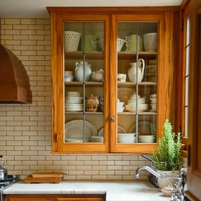
We skipped putting in a backsplash, see, because I've grown sick to death of seeing kitchens clad in white rectangular tile, a.k.a. subway tile. Everyone says it's "timeless" and "classic," but people also thought Sophia and Olivia and George were fresh baby names about 5 years ago. Anti-trends become trends. And while I'm certainly not claiming to be immune to decor trends (hello, herringbone tile all over mah house, and subway tile in my kids' bathroom), I hated to jump right on the subway train for my long-awaited kitchen without at least considering other options.
Problem was, I couldn't find another option that made sense or excited me. Tiny mosaic tile? Just what I needed—more grout to clean. Spanish or Moroccan-style painted or encaustic tiles? Too busy for the space. Rustic travertine? Too porous. Stainless steel tile? Ew.
Hubby and I had already chosen to put a steel panel behind our commercial-style range, and we're clean-as-you-go cooks, so really: Did we need to cover the rest of the kitchen in ceramic or stone? We started to doubt it.
The backsplash-free countertops. Is this sacrilege?
Now the kitchen's finished, sans backsplash. Some days I love the look. Seeing the plaster walls instead of ceramic tile makes the kitchen feel kind of homey and warm, not cold and washroom-y. Other days I look at the walls above the counters and they look so naked. Should I have gone subway after all?
In the last few days, I've been tinkering with the idea of applying subway tiles of the peel-and-stick variety, like Smart Tiles or StickTiles, pictured below. At $25 for four sheets, the StickTiles are not a huge commitment, and they could let me "try on" the look before committing to an expensive tiling project.
Source: StickTiles
But then, a few days ago, I saw this gorgeous pic on queen-of-style Aerin Lauder's Instagram feed...
Credit: @aerin
... and I thought, holy CRAP. Square tile! Is it back? Is this The Thing I Need?
Yes, square tile. Just when I thought we couldn't go more public-restroom chic than rectangular subway tile, in marches the square variety, just waiting to cover our bathrooms, kitchens, and mudrooms in industrial-cool goodness. The tile in Lauder's pic, above, takes square in a luxe direction via a rich, translucent taupe glaze; I'm not sure where it's from, but it no doubt costs $$$. The extra-wide grout gives the shape even more oomph.
It led me on a search for more square tile inspiration, and now I'm realizing how cool the plainer square stuff can be, too. I mean, look at these pics.
Credit: The Winchester Tile Company
Source: Door Sixteen
Source: DecorPad
Source: House & Home
Is this what I need lining my kitchen walls? Will I just regret following this trend instead of the last? Do you even like the look? Should I stick with the StickTiles? Please discuss.


